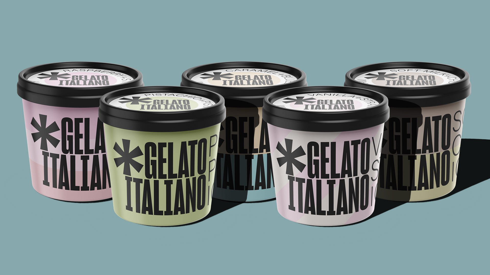
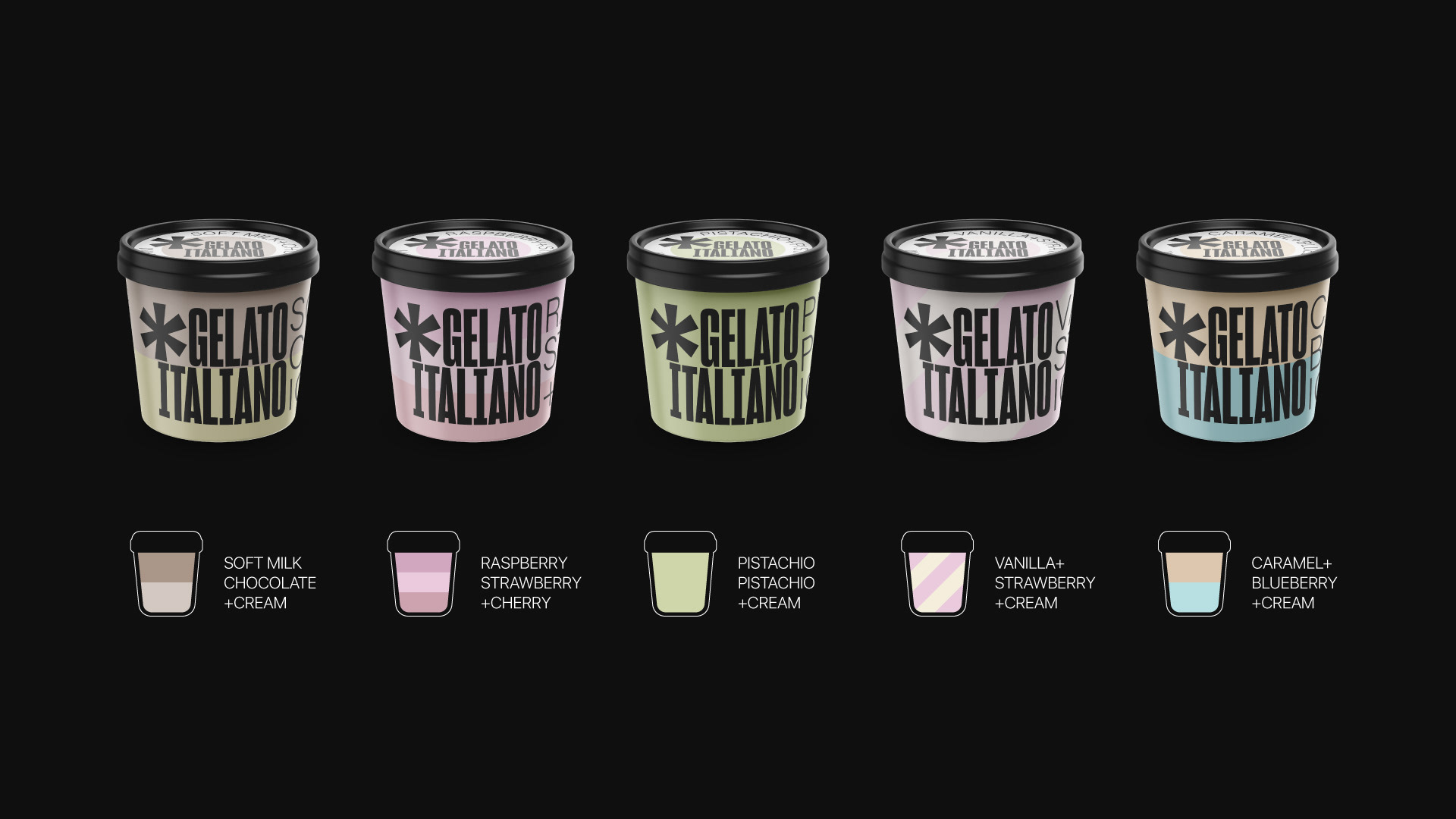
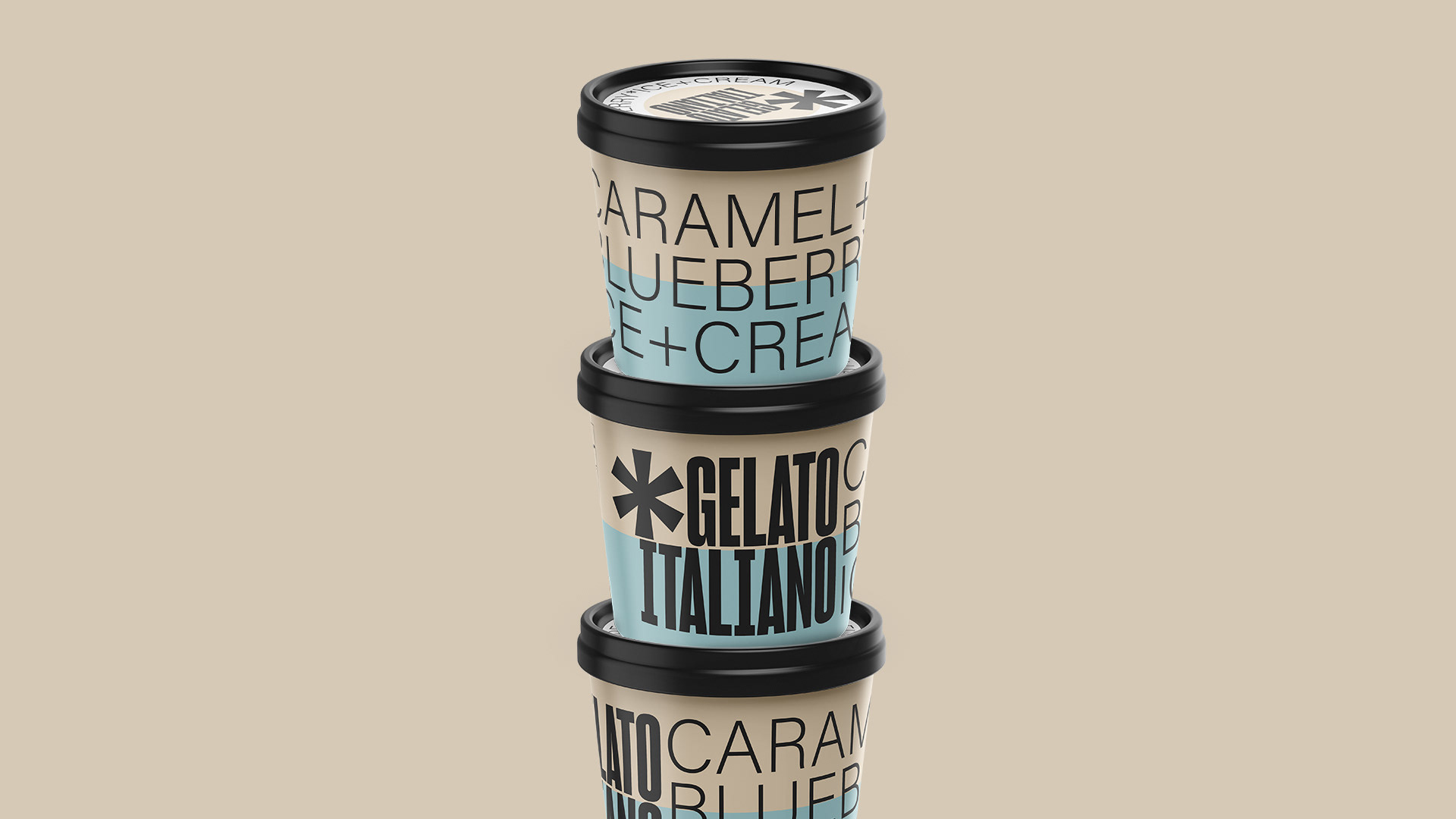
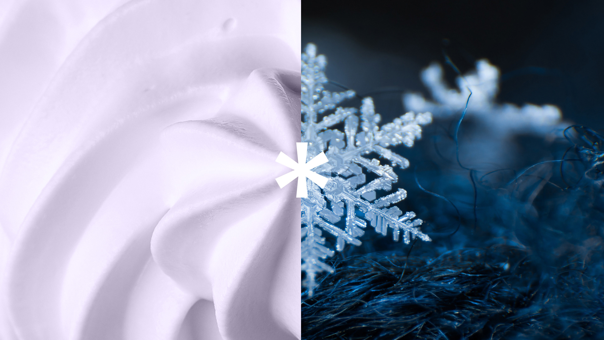
Although the logo is a familiar symbol, it has a snowflake structure reminiscent of ice cream. It is also filled into containers in this form during the production of ice cream.
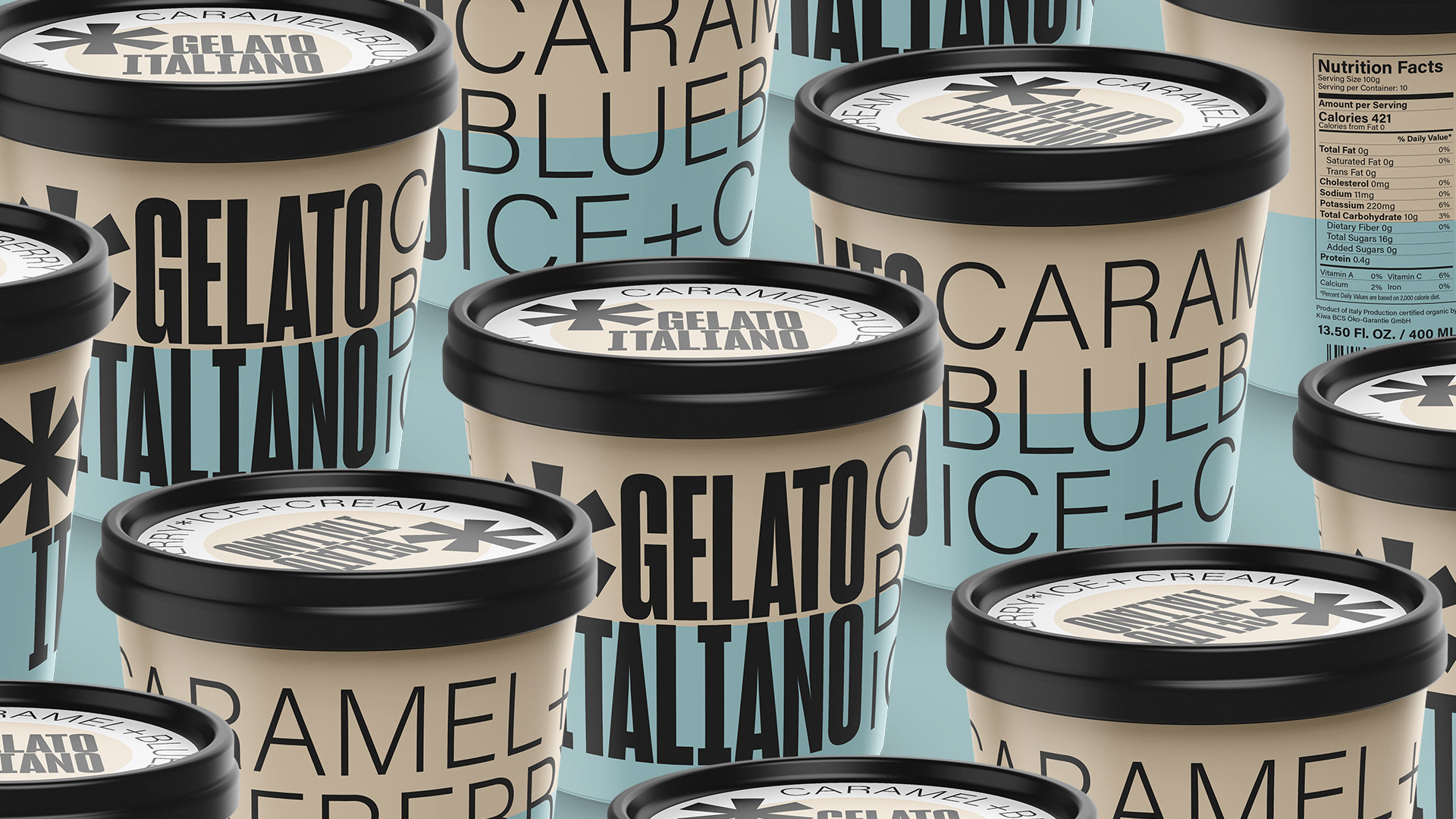
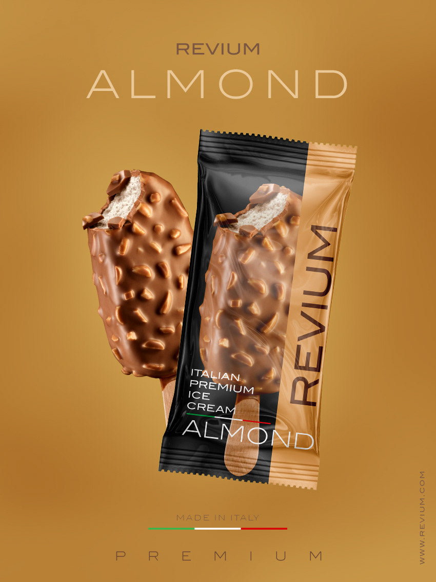
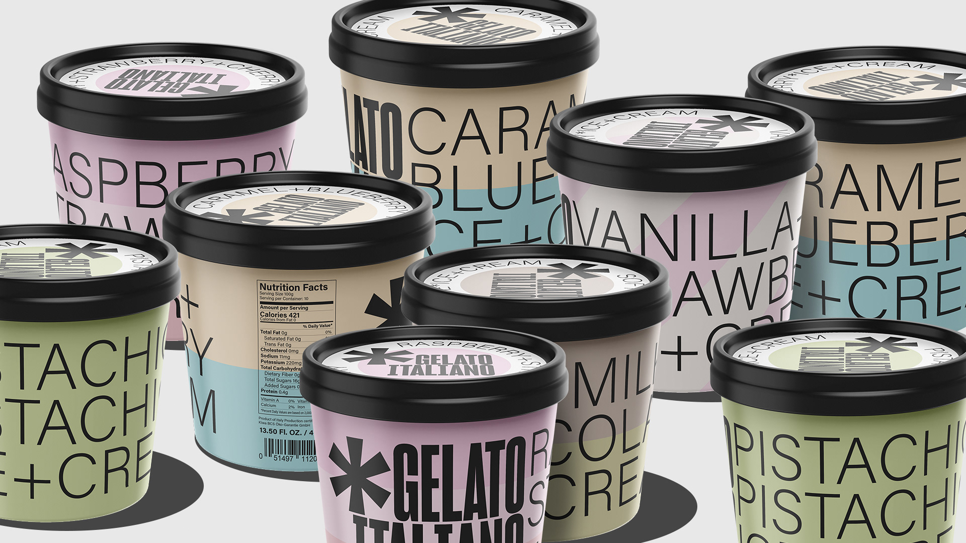
It is very difficult to choose among the colorful and attractive ice creams. For this reason, we approached ice cream with a minimal and typographic solution. We used large font and bold lines to represent the inside of each ice cream. The product is considered the upper segment of the socioeconomic level.This style and approach differentiates the brand from its competitors and clearly shows that it is a unique and rich product. People now expect and value honesty in the use of food products. To this end, we do not use misleading graphics or photographs. We show exactly what we are selling and this shows our honesty and authenticity.
Thanks!