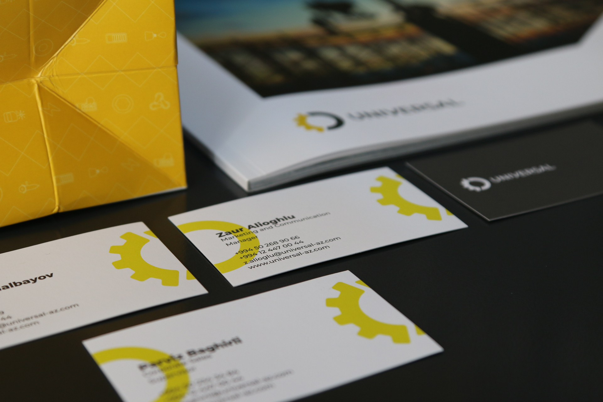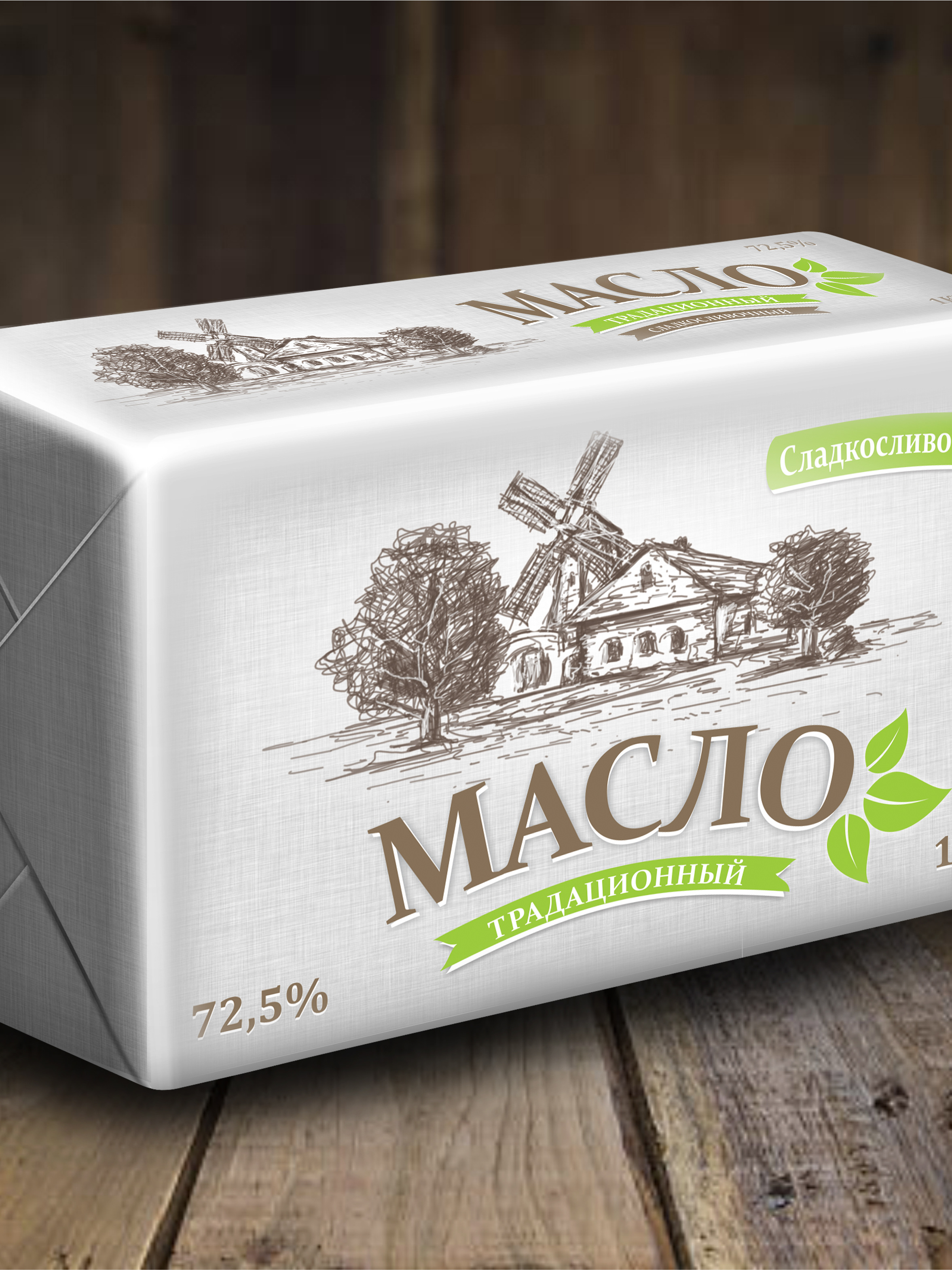
Universal Pro LLC Rebranding
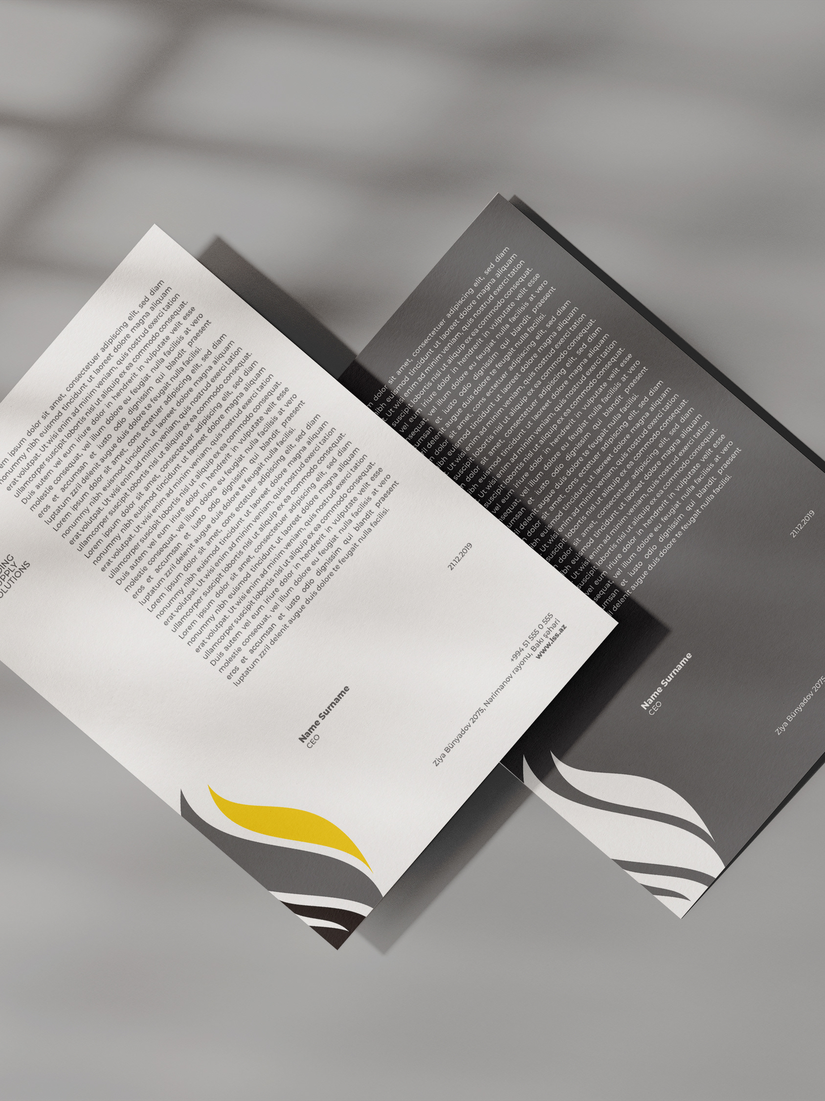
Brief: Universal Pro LLC ordered our studio to change the 20-year-old branding of the company. With over 20 years of experience, the company has already formed its own mold in the brains. When people saw the name or logo of the company, they immediately understood what company they were talking about. The company came to this rebranding at yhe end of long way. The company asked to us work on it without changing main values and the style of the logos formed in the brain. The company, based on the 5 basic values, did not want to change its colors too.
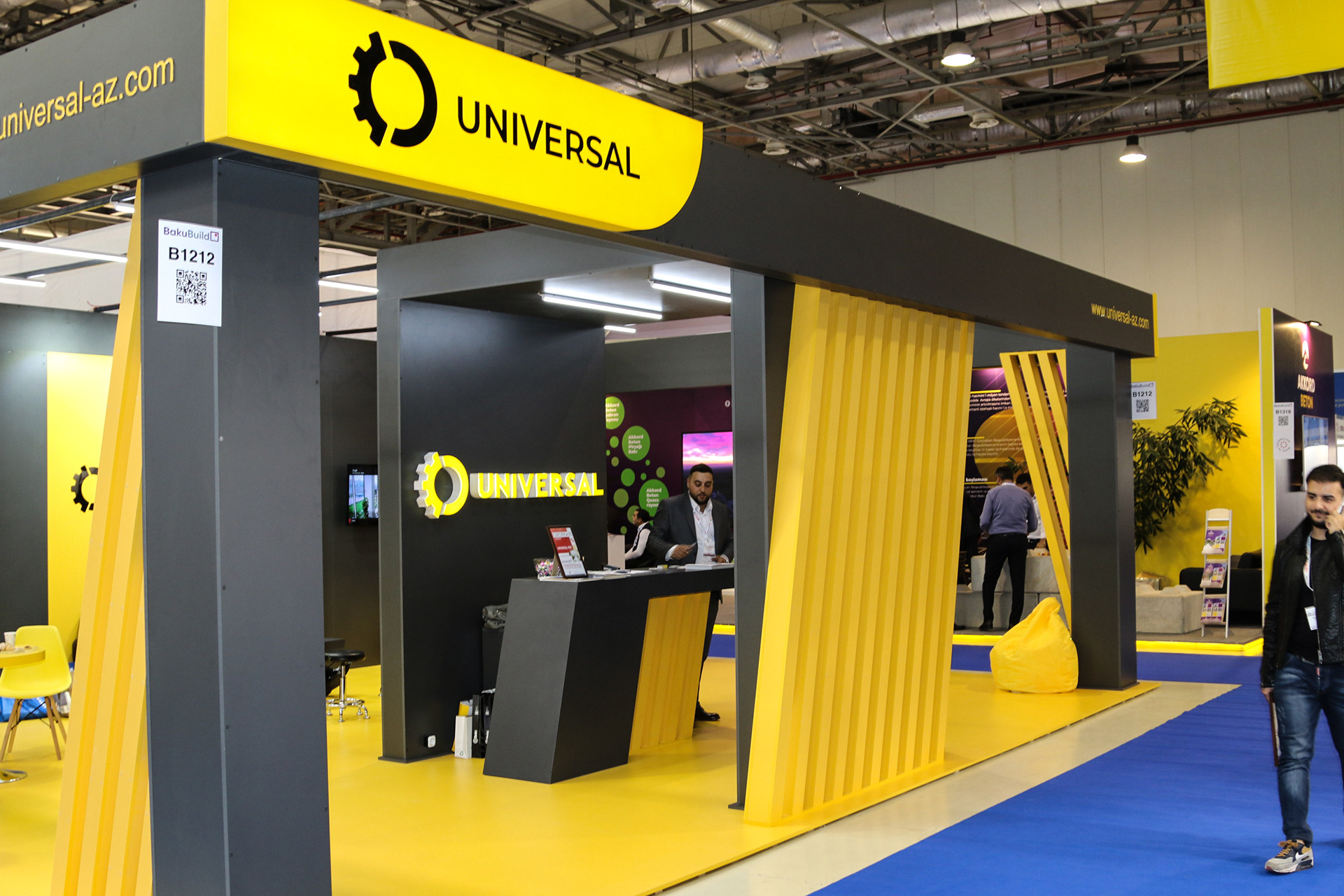
Research: Immediately after the order, we conducted a market survey. Throughout this research, we have become familiar with many brands and aim to make our design superior to those brands. We have noticed that yellow is important for people working in this sector. In some sectors, the yellow was irritated, but in this sector it was able to attract more confidence.
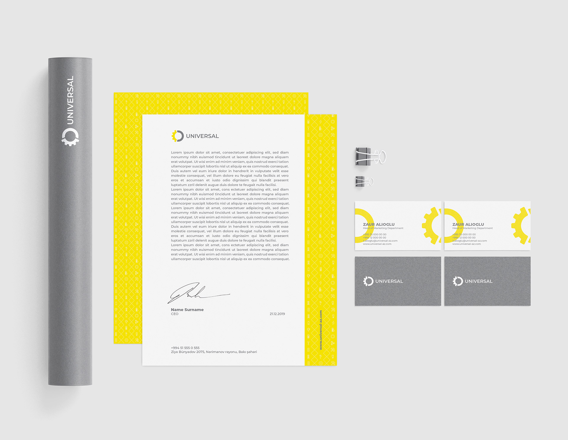
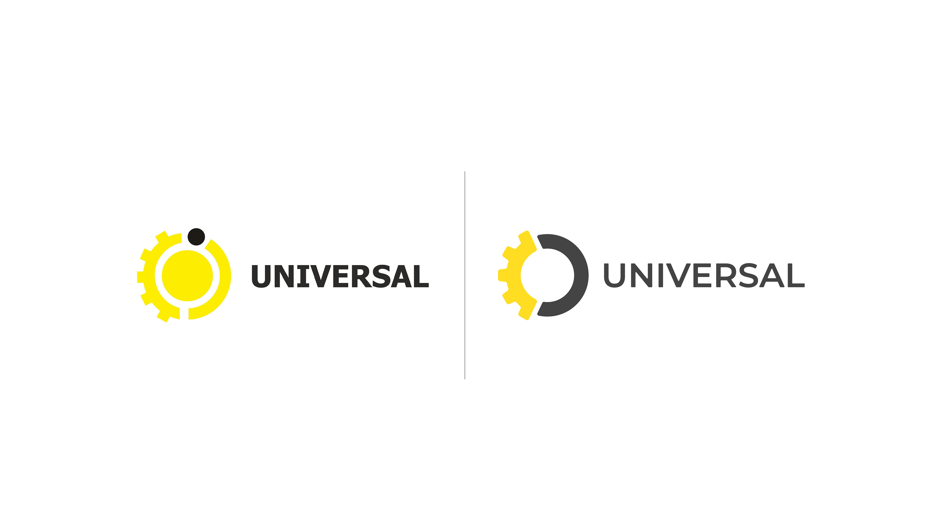
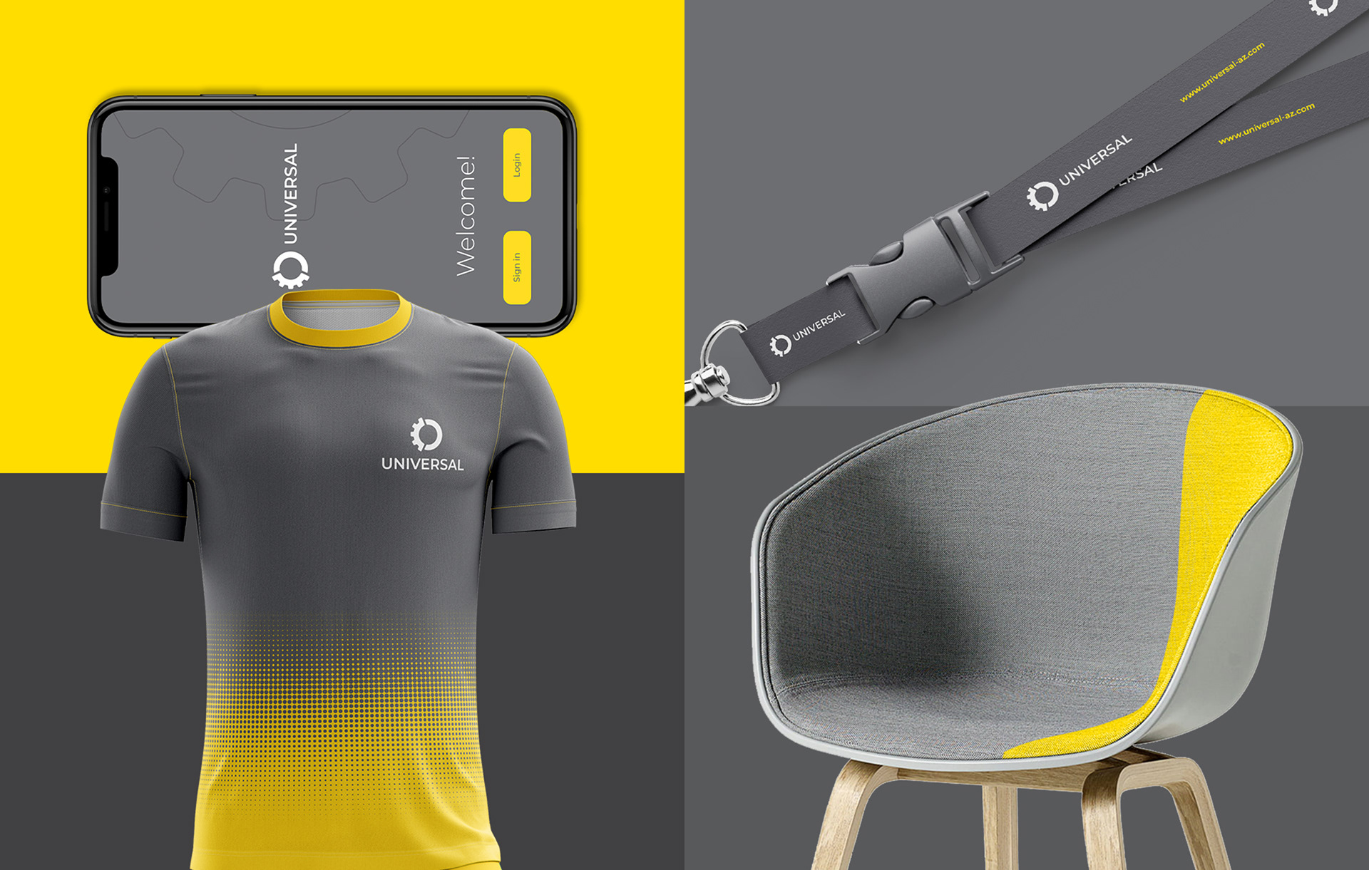
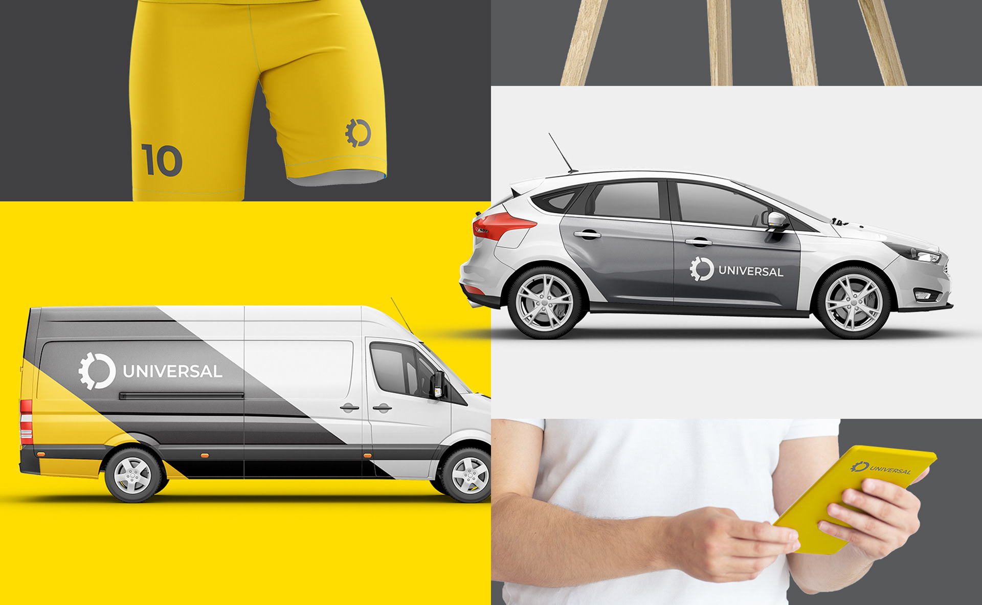
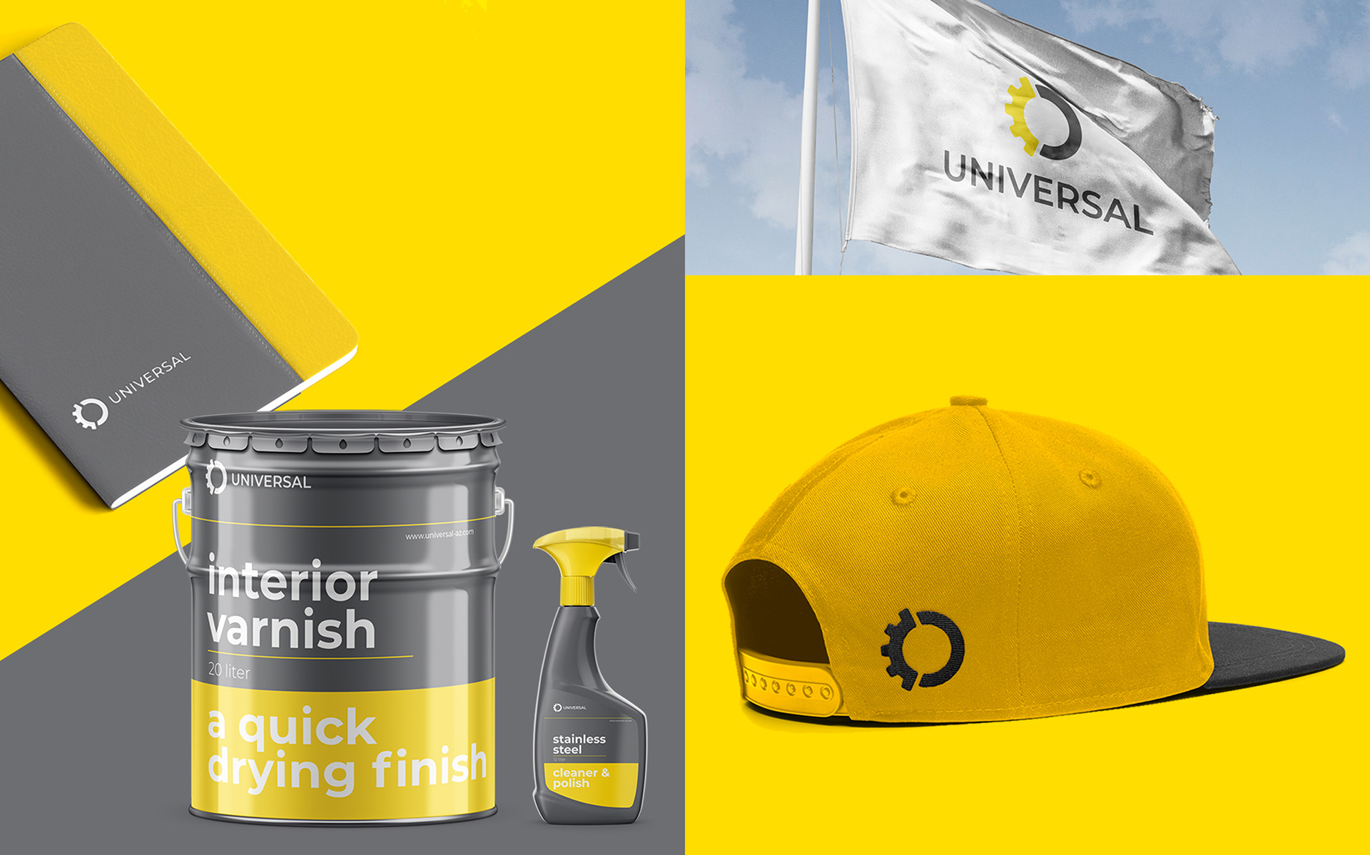
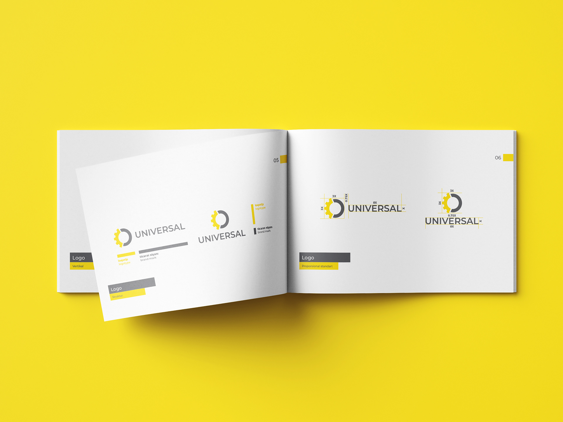
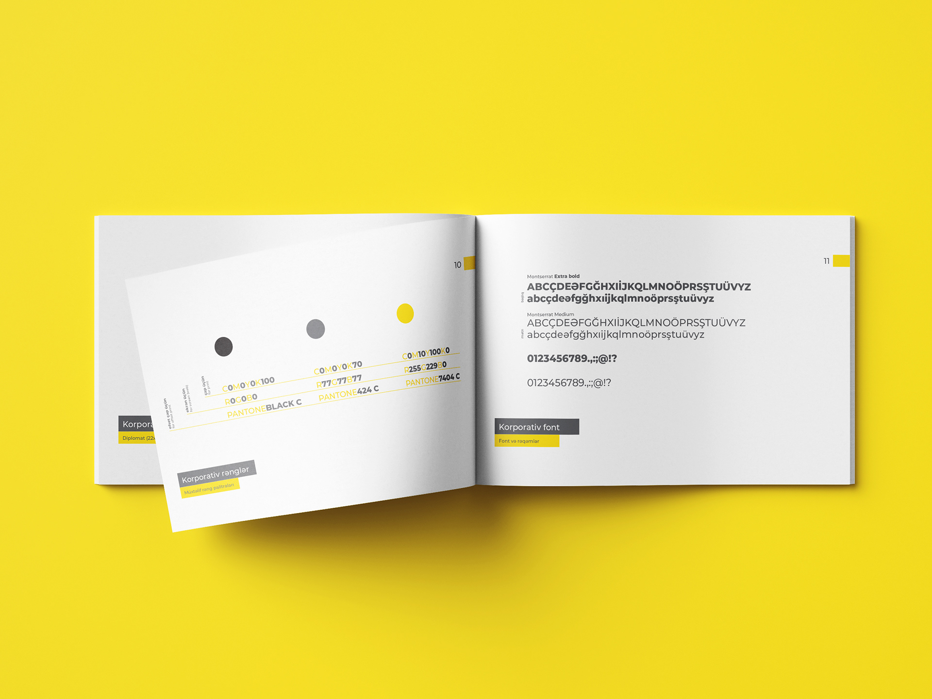
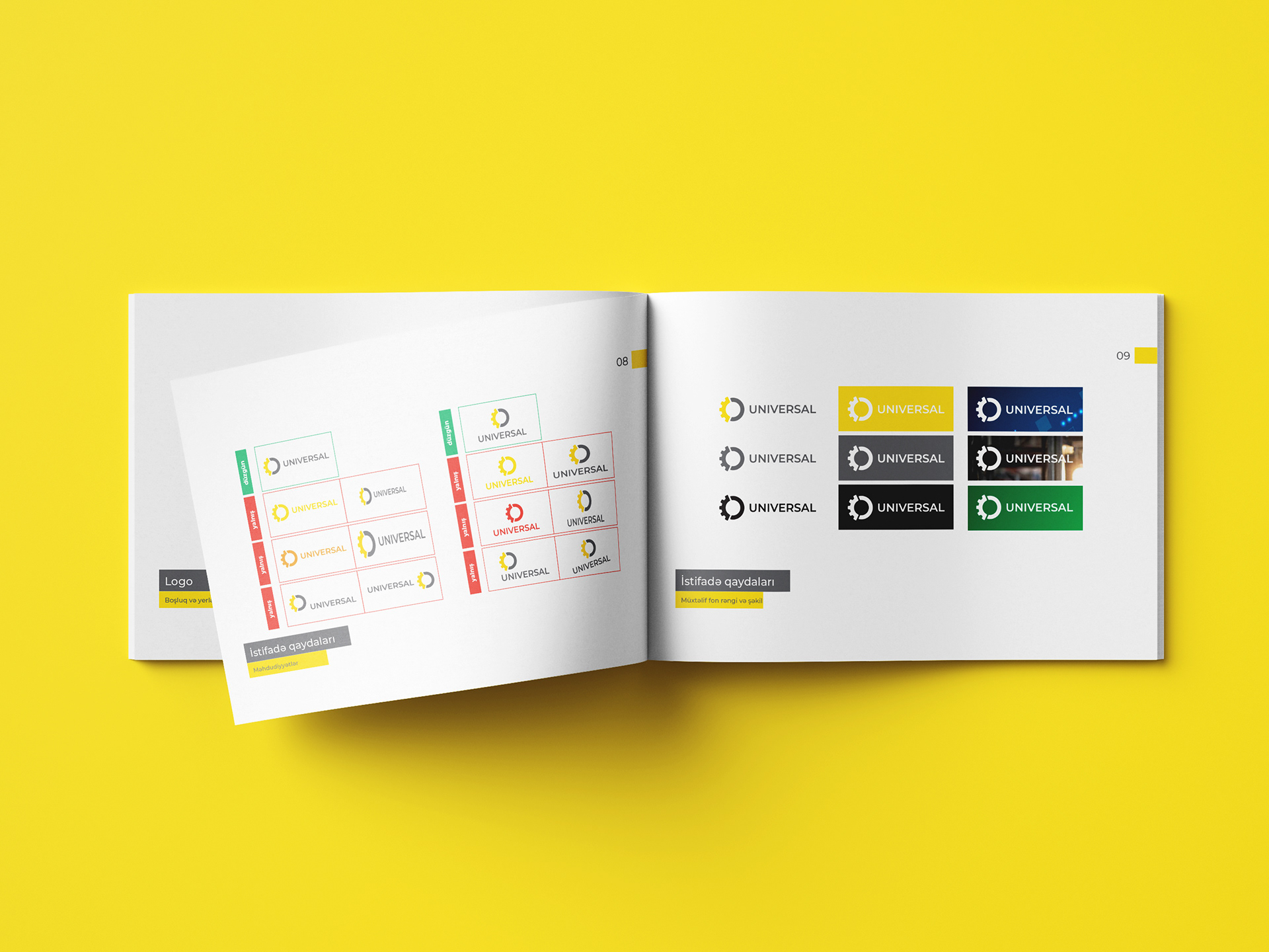
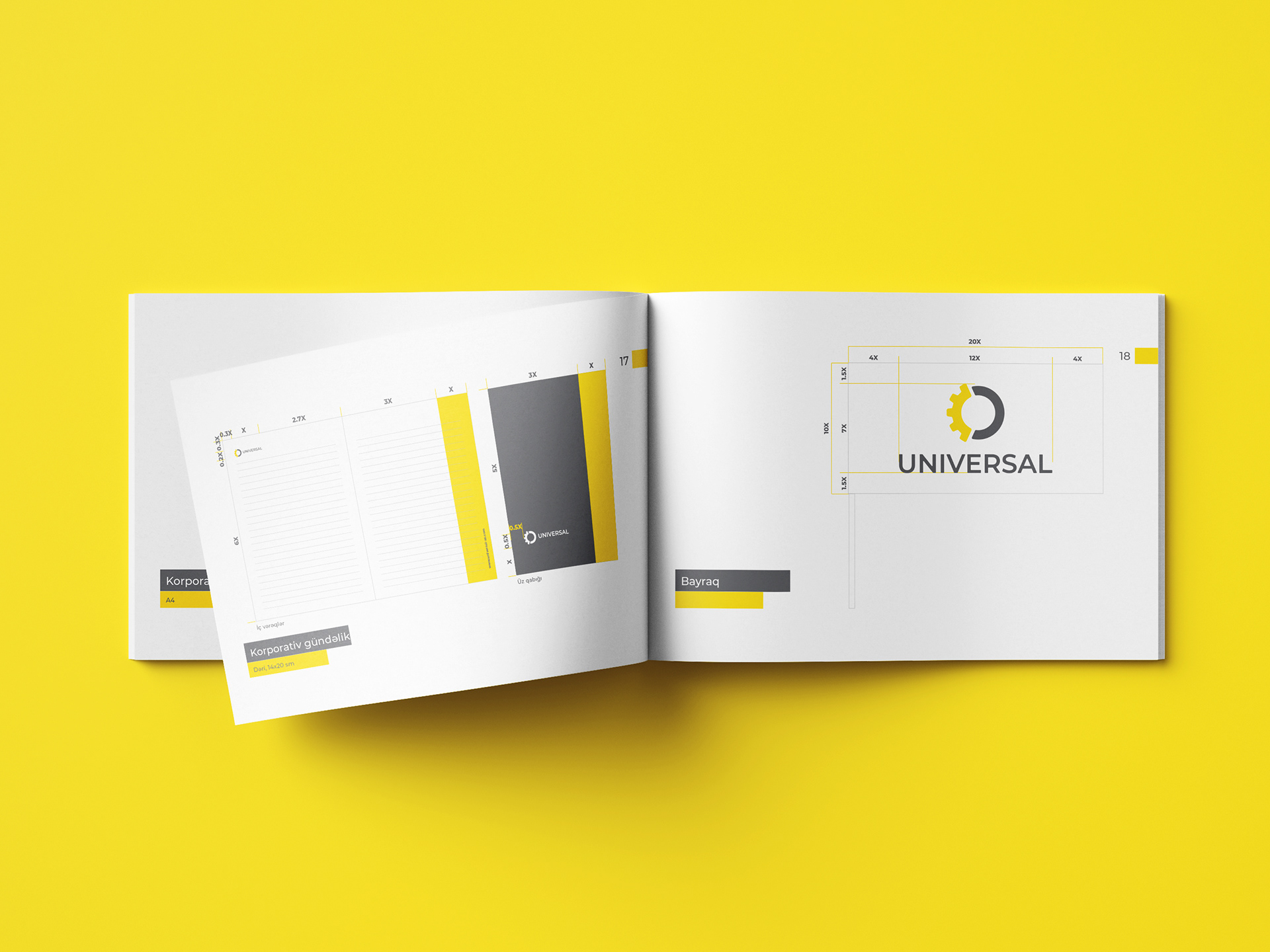
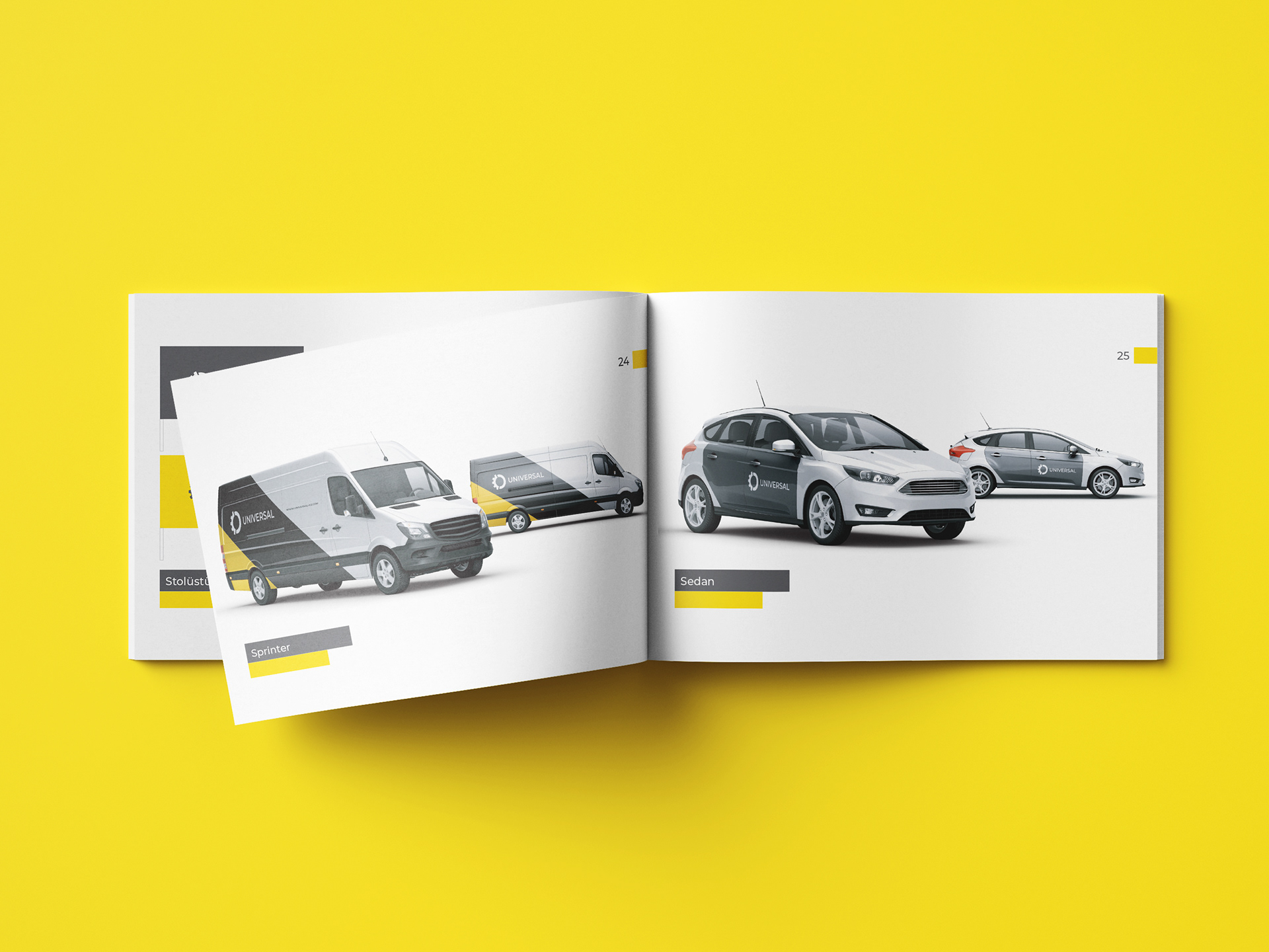
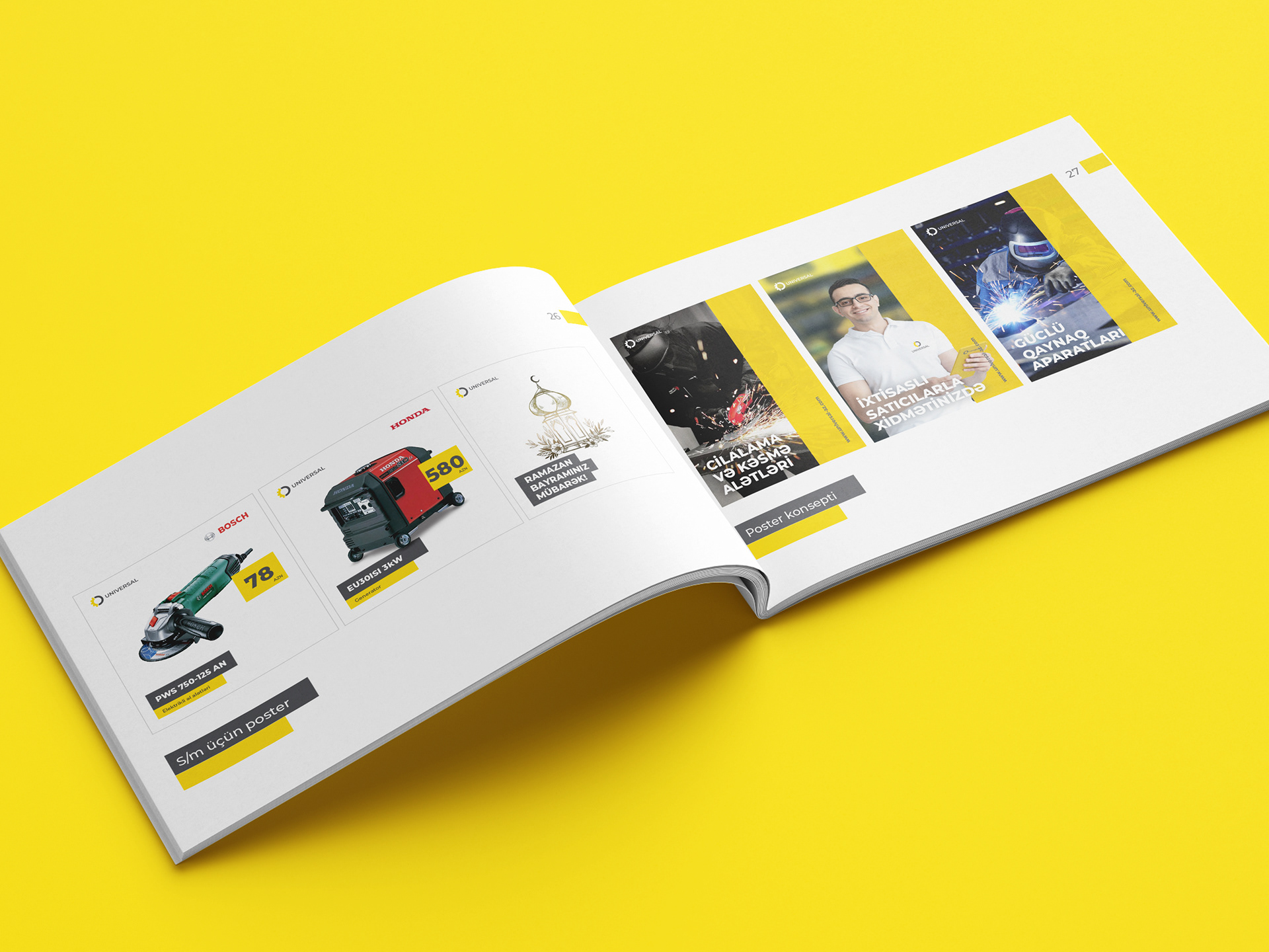
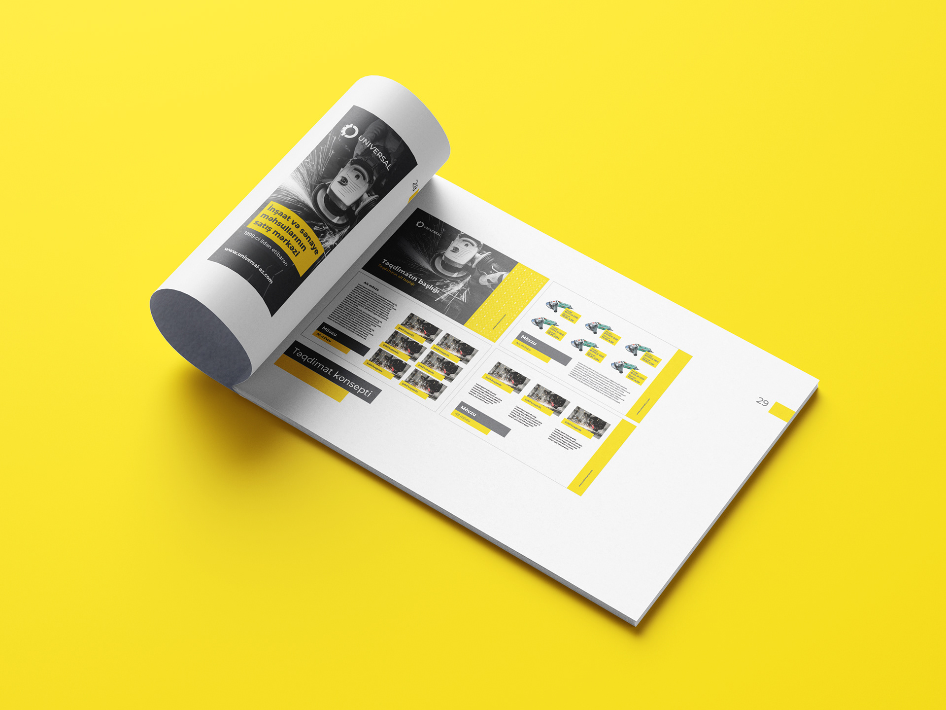
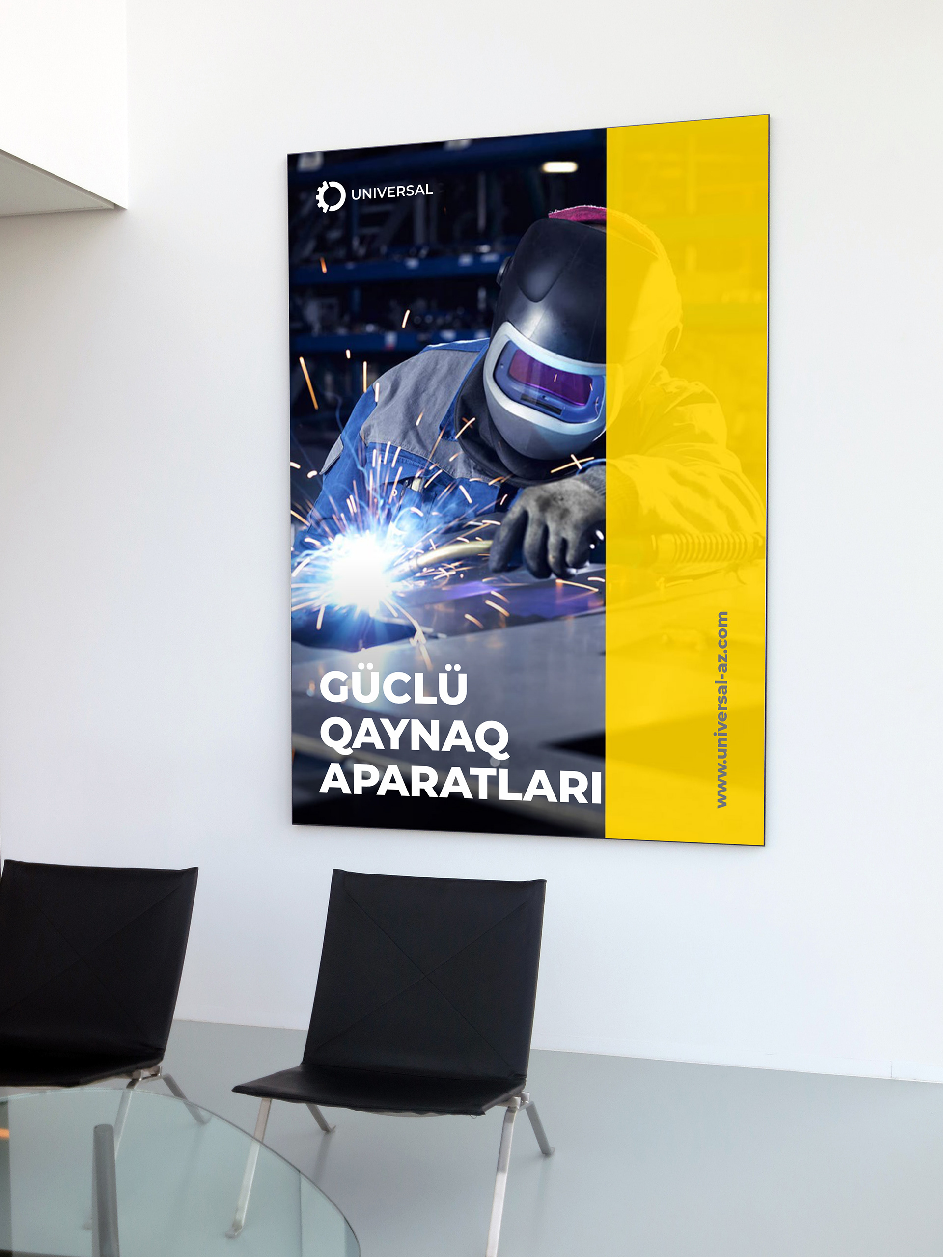
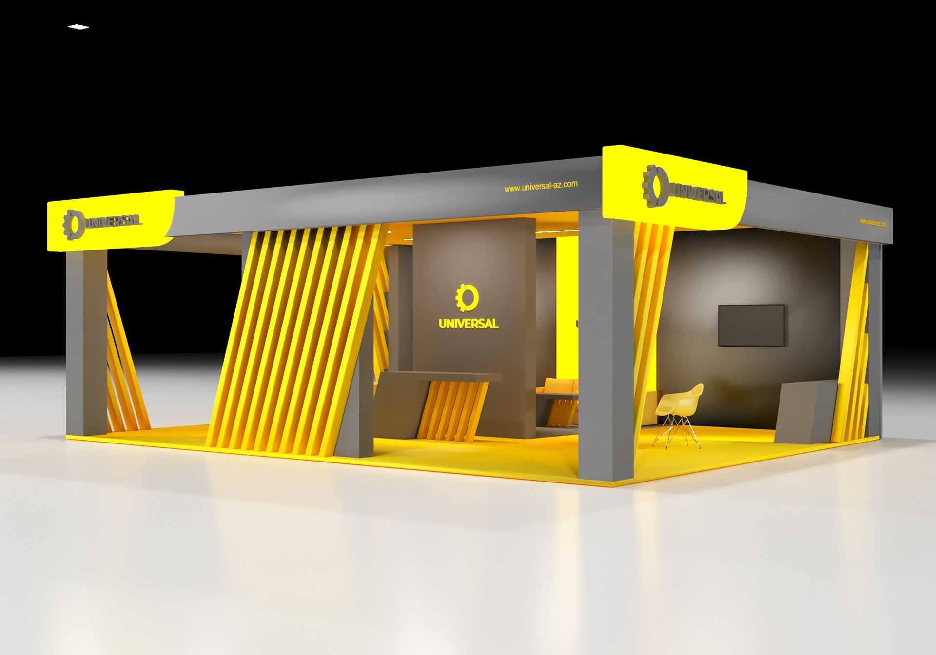
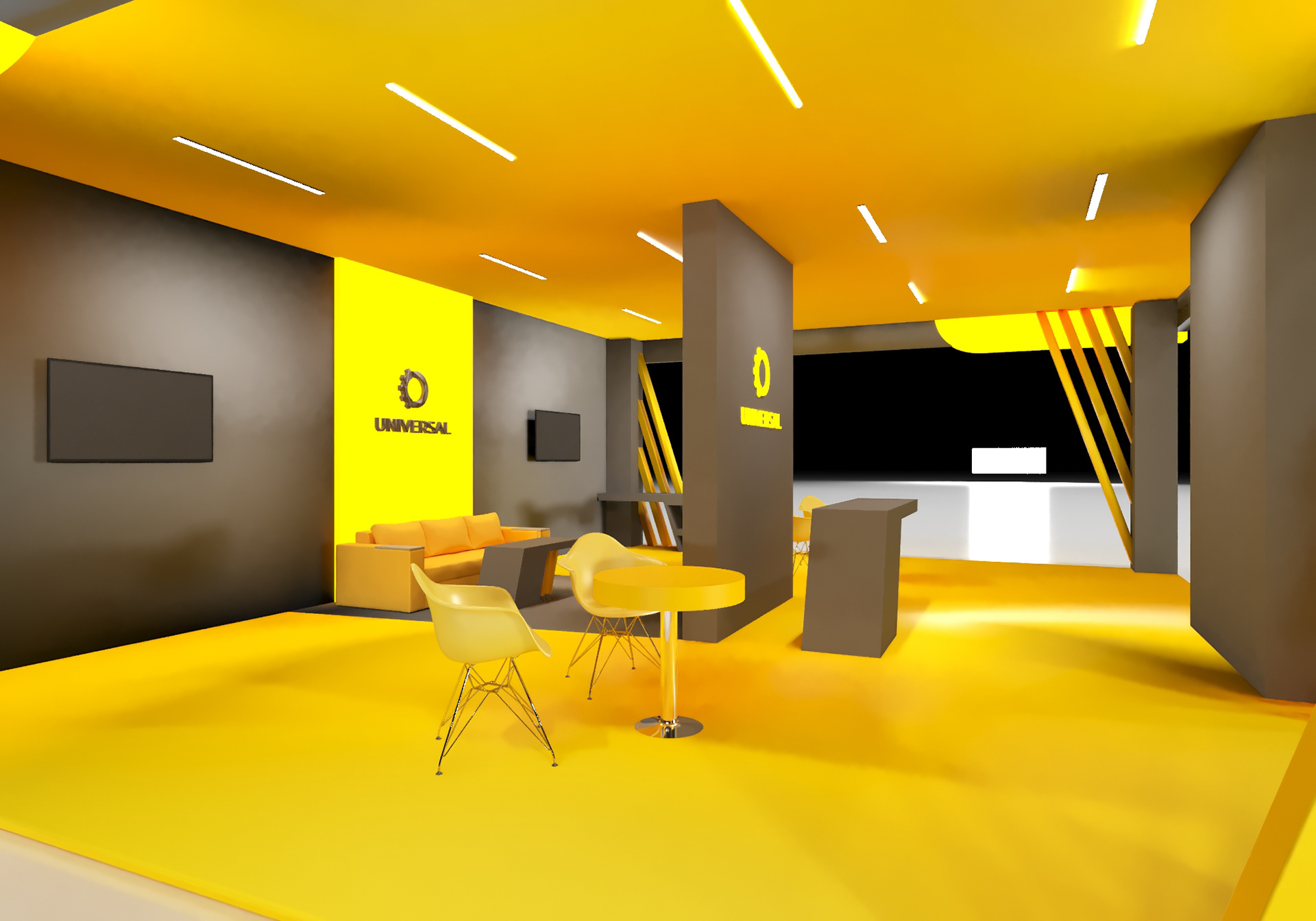
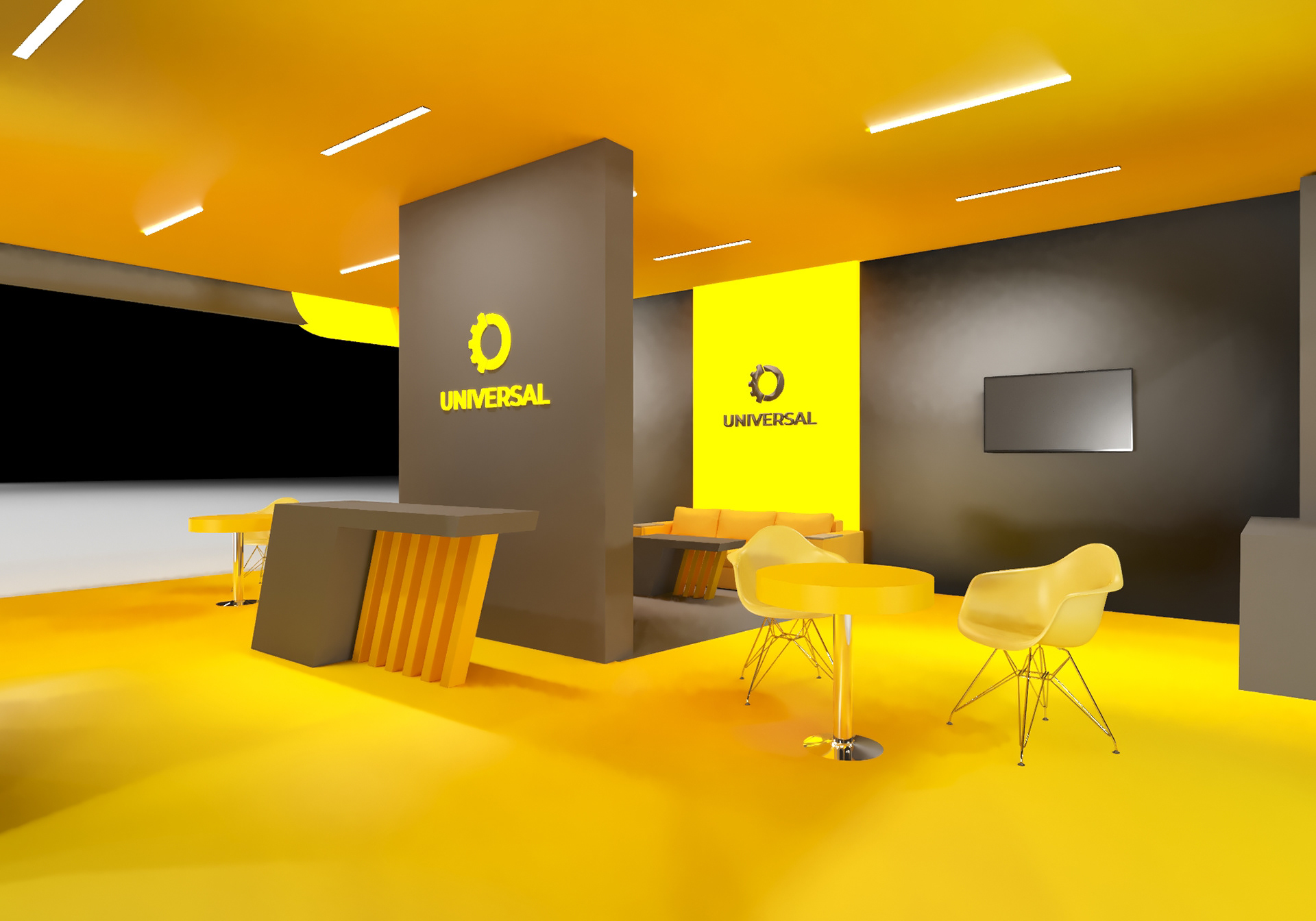
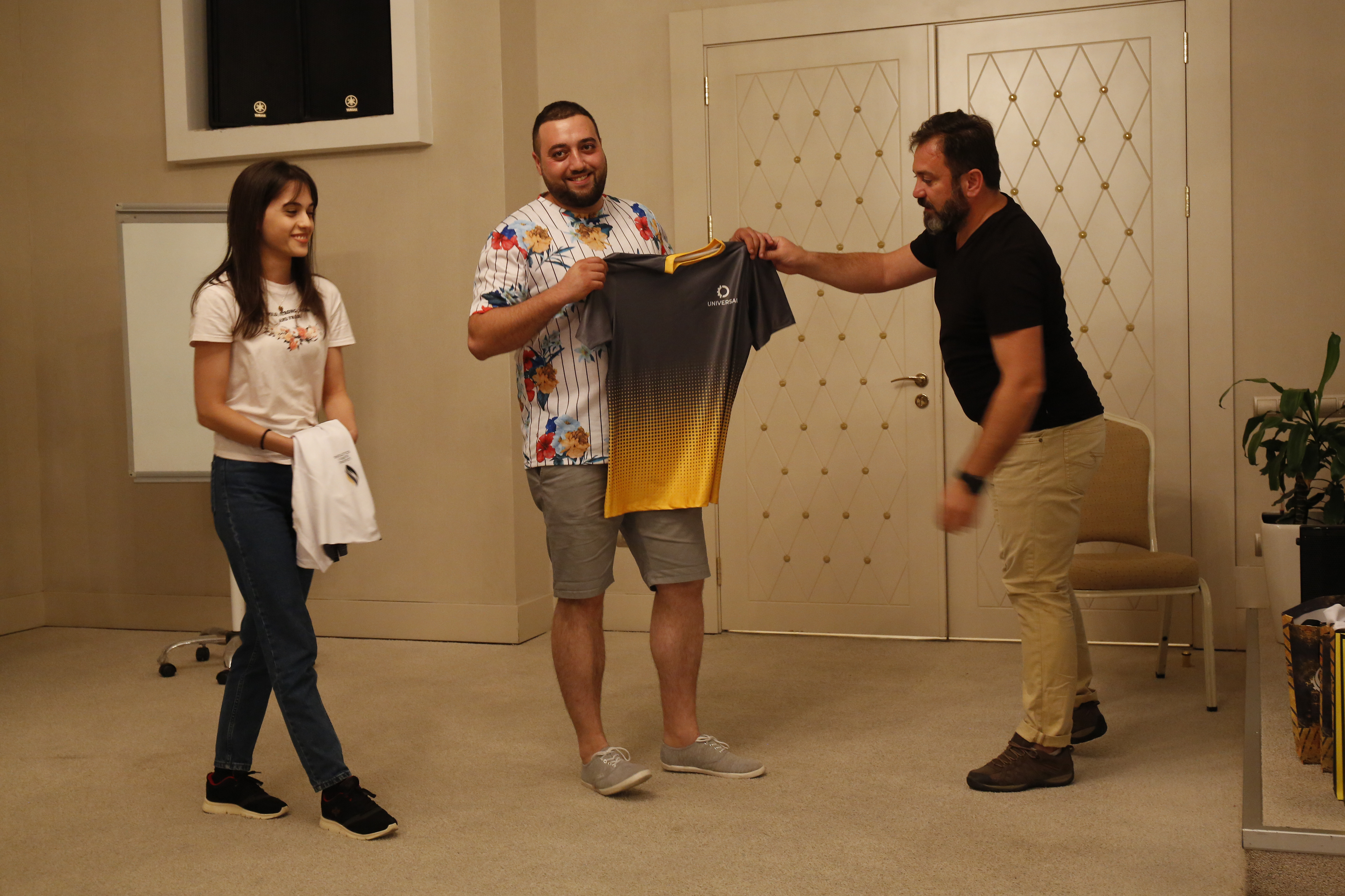
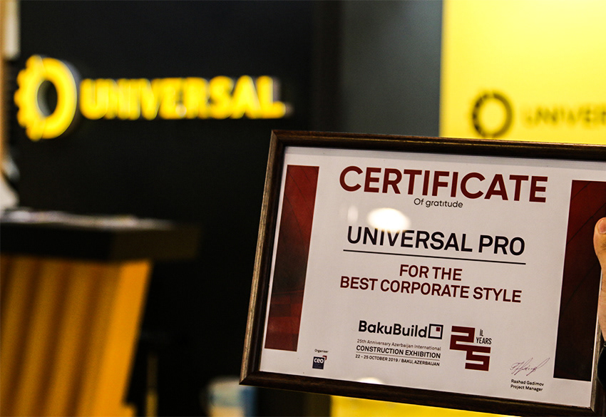
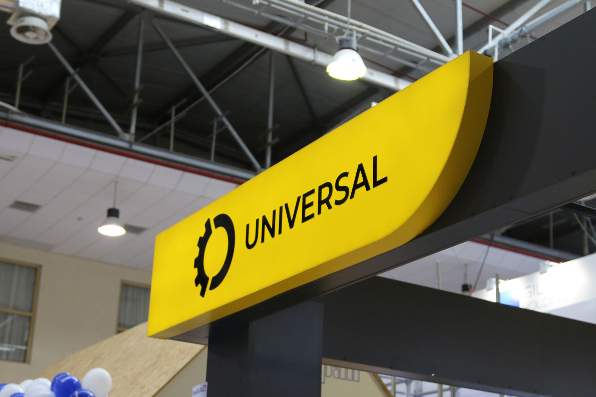
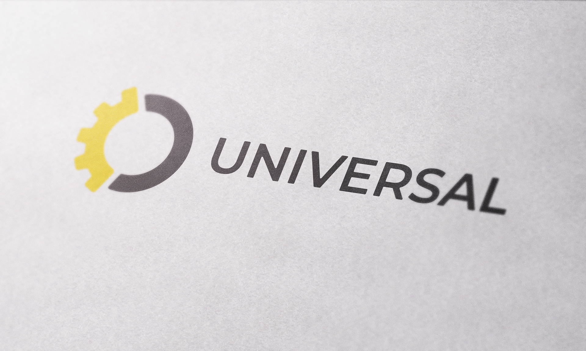
Solution: We kept main 5 values of the company untouchable. Design element with 5 bough mains worths. On the right-hand arrow, we show a successful future built on values. That is, the company is developing with its values. We changed the color to an invisible and easily recognizable yellow. We did not use black, instead we preferred dark gray. Thus, the logo is now more easily absorbed in new colors. We have used the color combinations in our corporate style to create a company-reminded function in any print or electronic product. Communication is now becoming more accurate. We have minimized logo by removing the additional parts.
The logo is thus fully adapted to modern trends while maintaining the image and style of a company with a dynamic growth strategy.
The logo is thus fully adapted to modern trends while maintaining the image and style of a company with a dynamic growth strategy.
Client: Universal Pro LLC
Location: Azerbaijan, Baku