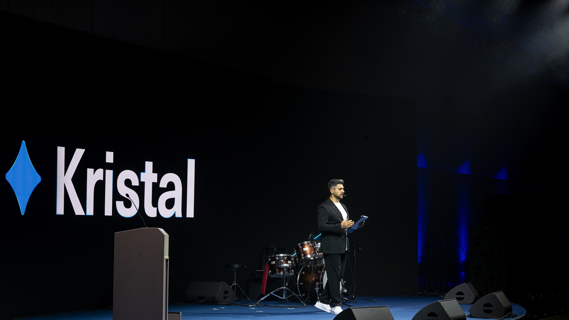

Client: Kristal Azerbaijan
Project: Kristal Rebranding
Agency: Rahim Ismayil Design
Creative Director & Designer: Rahim Ismayil
Motion Designer: Murad Guliyev
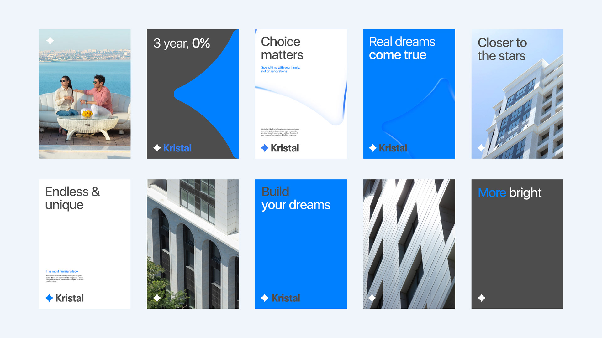
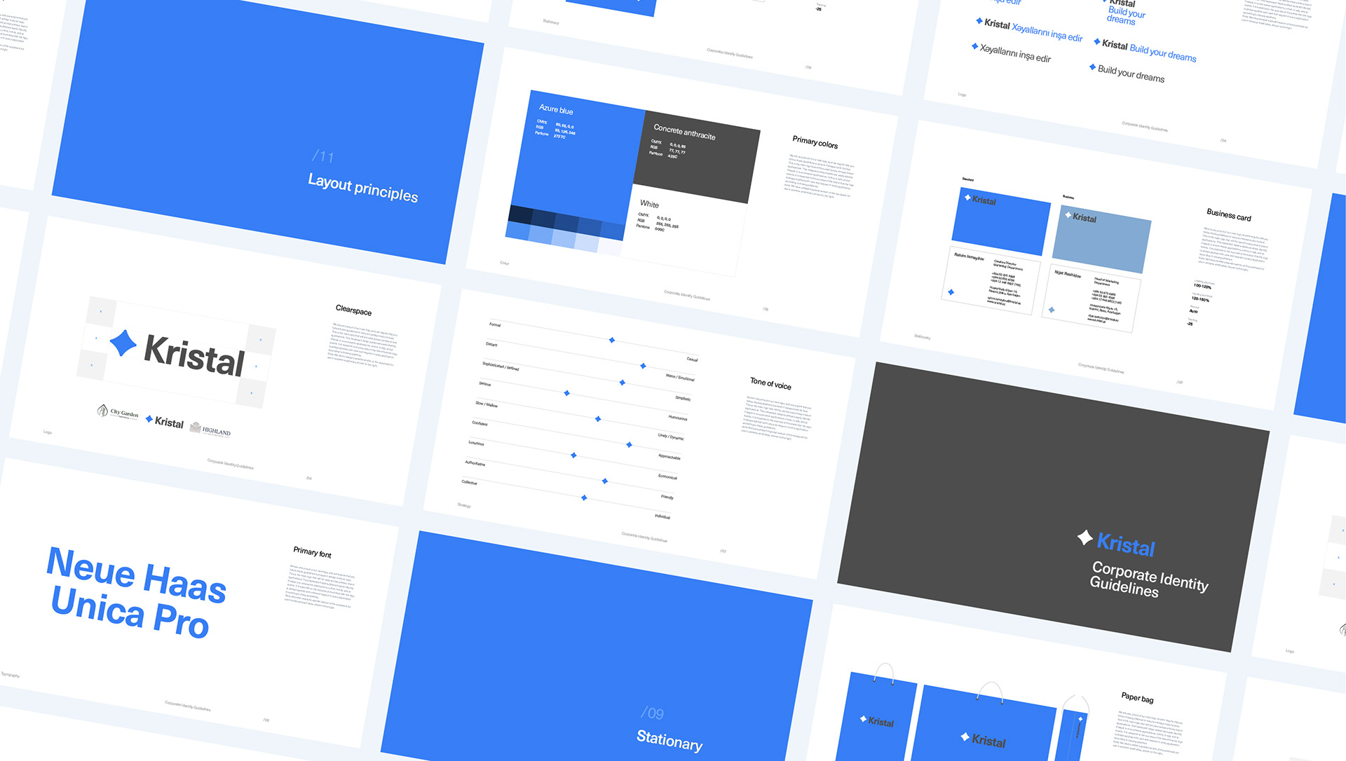
The brand’s new core strategy is to be clear, simple, and easy to understand.
We applied this strategy across all aspects of our work.
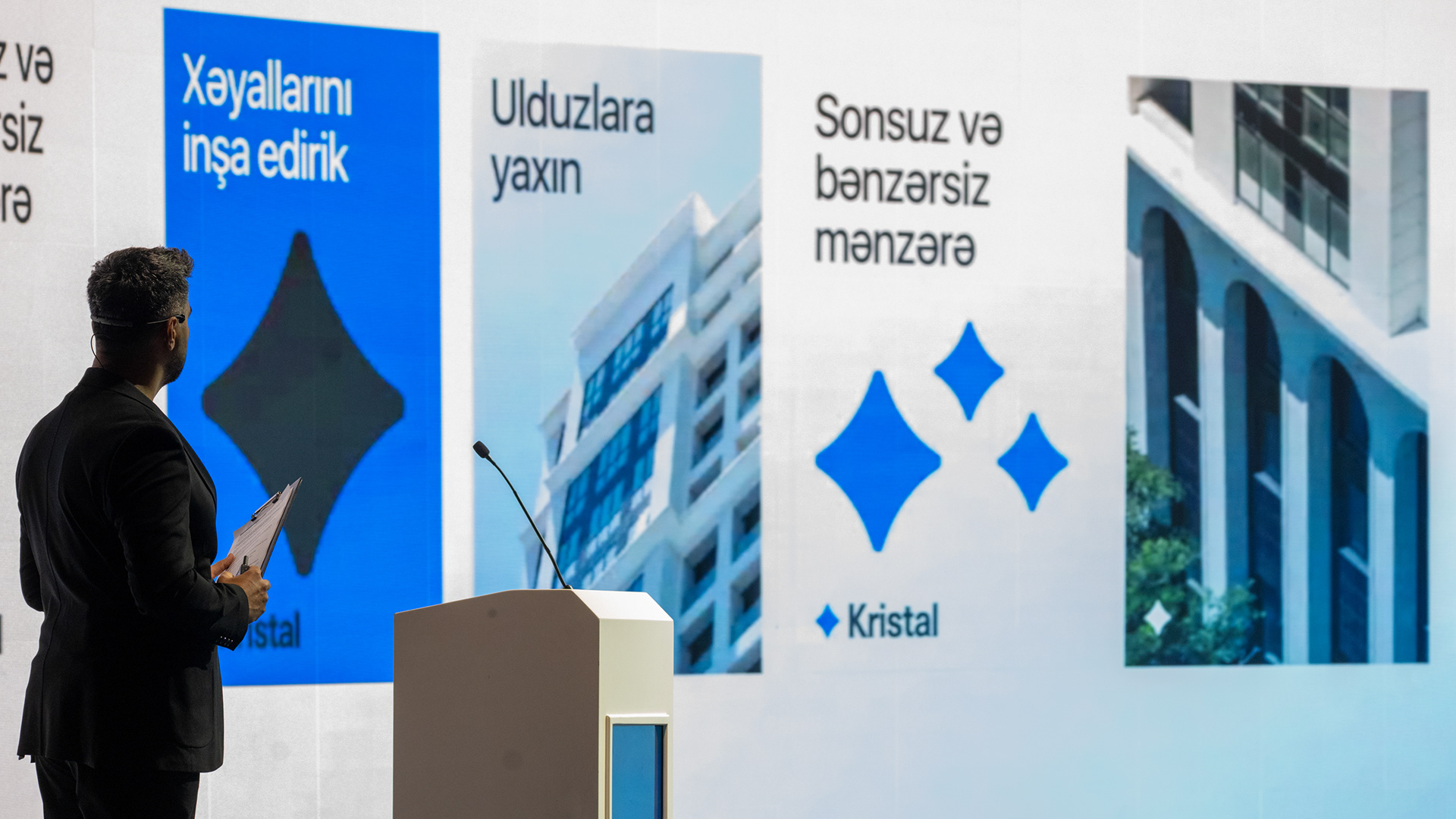
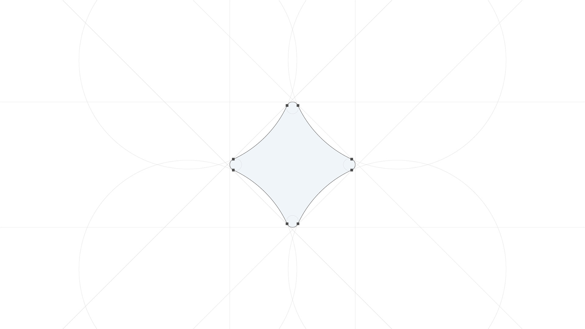
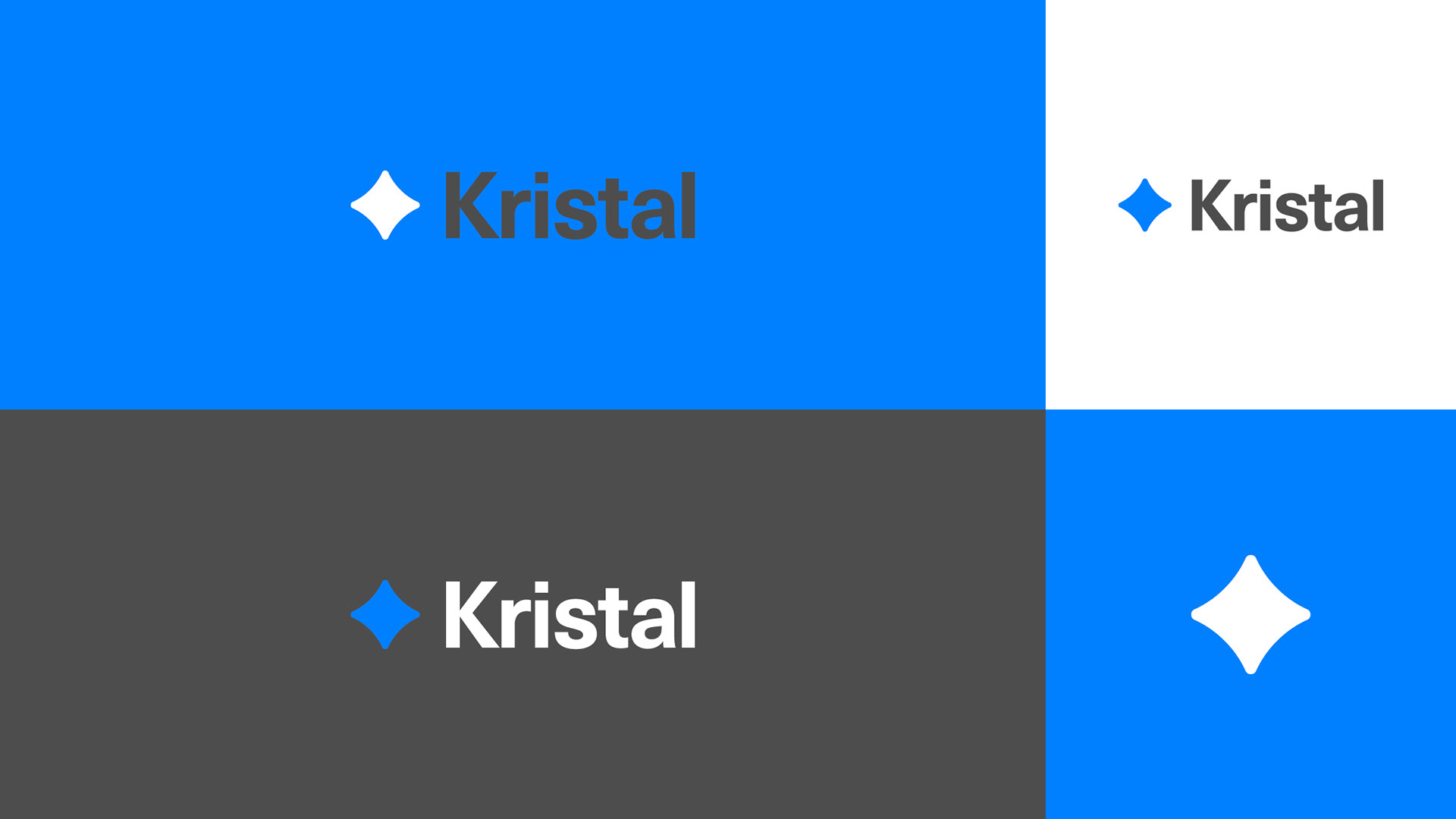
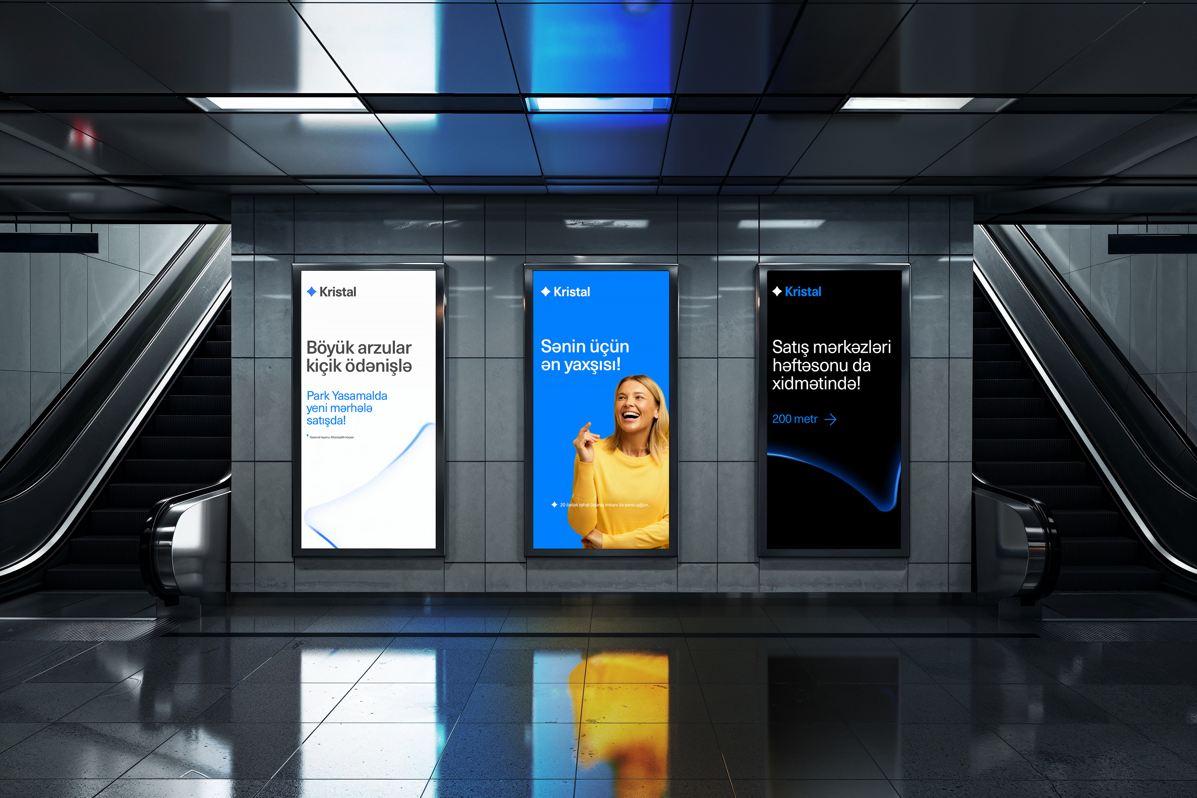
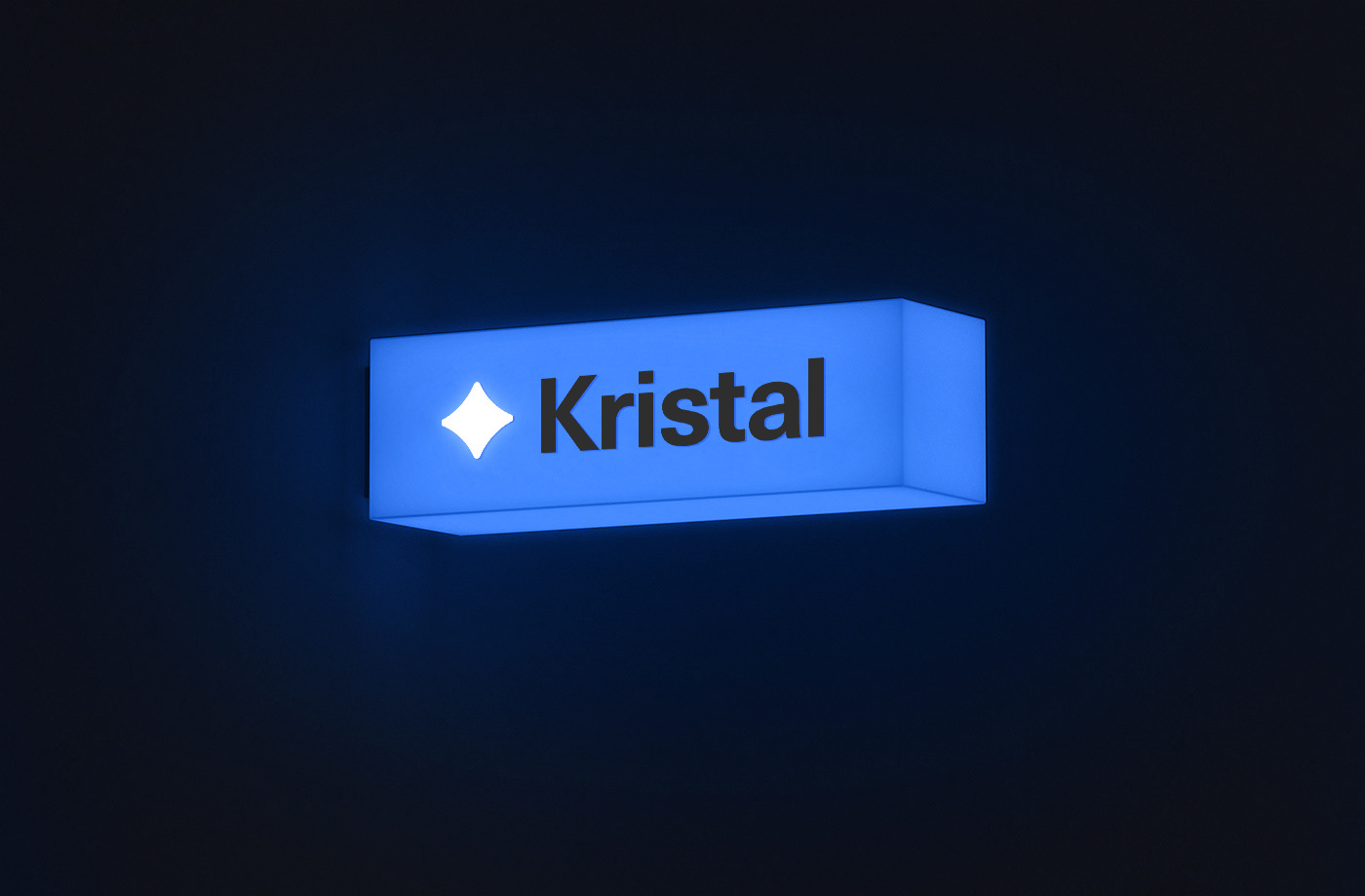
We likened dreams to stars and transformed this idea into a four-pointed star — representing both the sparkle of a crystal and the essence of dreams. The new logo symbolizes both the brilliance of a crystal and the dreams of people. A low-contrast design, with a gray logotype on a blue background, emphasizes the star element more prominently.
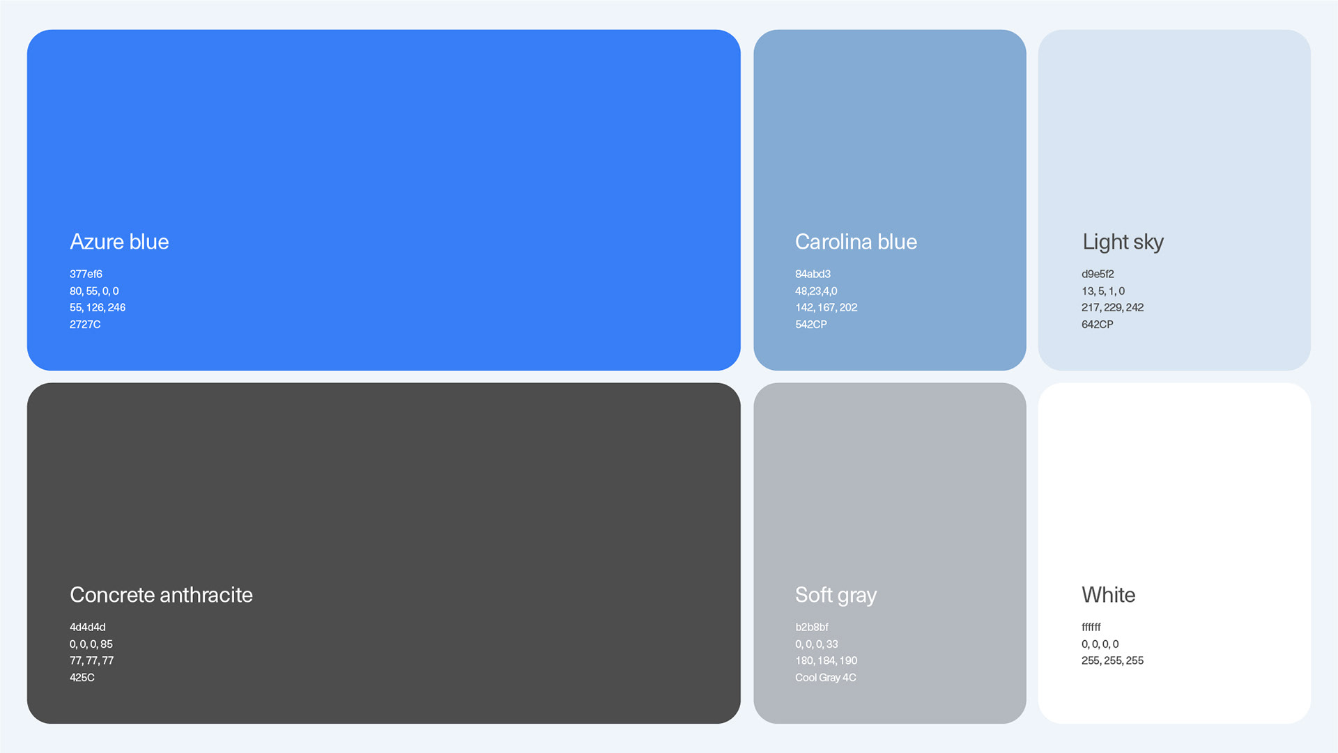
We reimagined the entire brand identity with just one attractive primary color. This single color now forms the foundation of the visual identity. People can now recognize the brand through its color alone — even without seeing the logo or name.
What problem does the new identity solve?
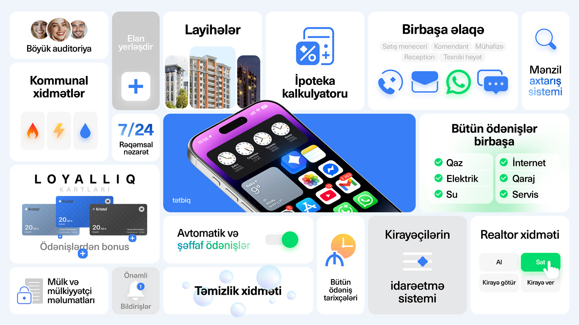
The new identity ensures seamless application across both print and digital platforms. Flat colors and clear typography offer perfect adaptability. It is simple, confident, and professional — making the brand more credible and trustworthy. The star icon is universally familiar and highly memorable.


Kristal is one of the largest construction companies in Azerbaijan.
The brand has been active for 22 years, developing residential complexes for its customers. However, due to the lack of a distinctive and iconic brand identity, people often struggled to remember it. Additionally, as a construction company, it lacked the sense of trust and reliability that people seek.
We based our new strategy on the company's core motto: "Build Your Dreams."


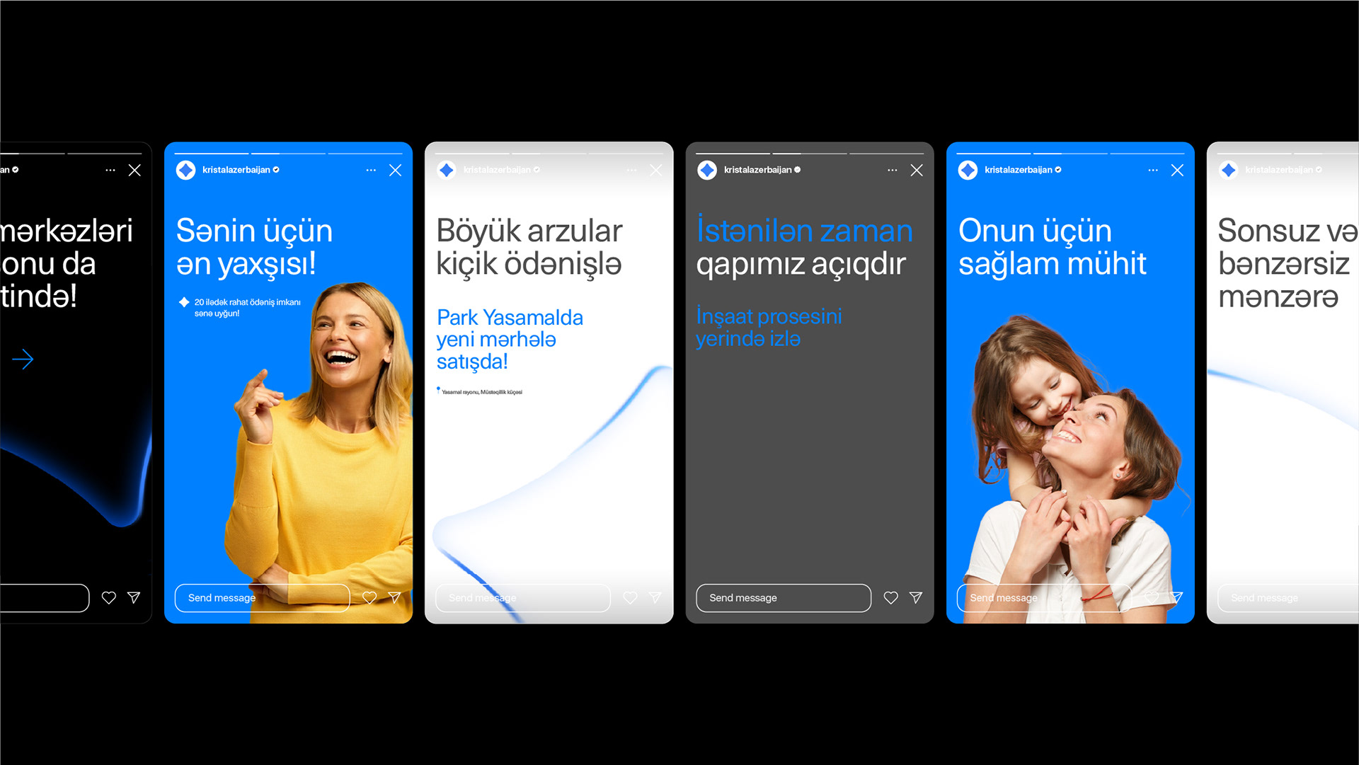


To fully implement the branding, we naturally adapted the app and website to align with the new strategy. The explainer videos showcasing the aesthetics and functionality of both the app and website were produced by our team. Agile, clear, and refined.