Kingsleaf Flavoured Fruit Infusions: A Visual Harmony of Flavor. Global market. Produced.
PROJECT OVERVIEW
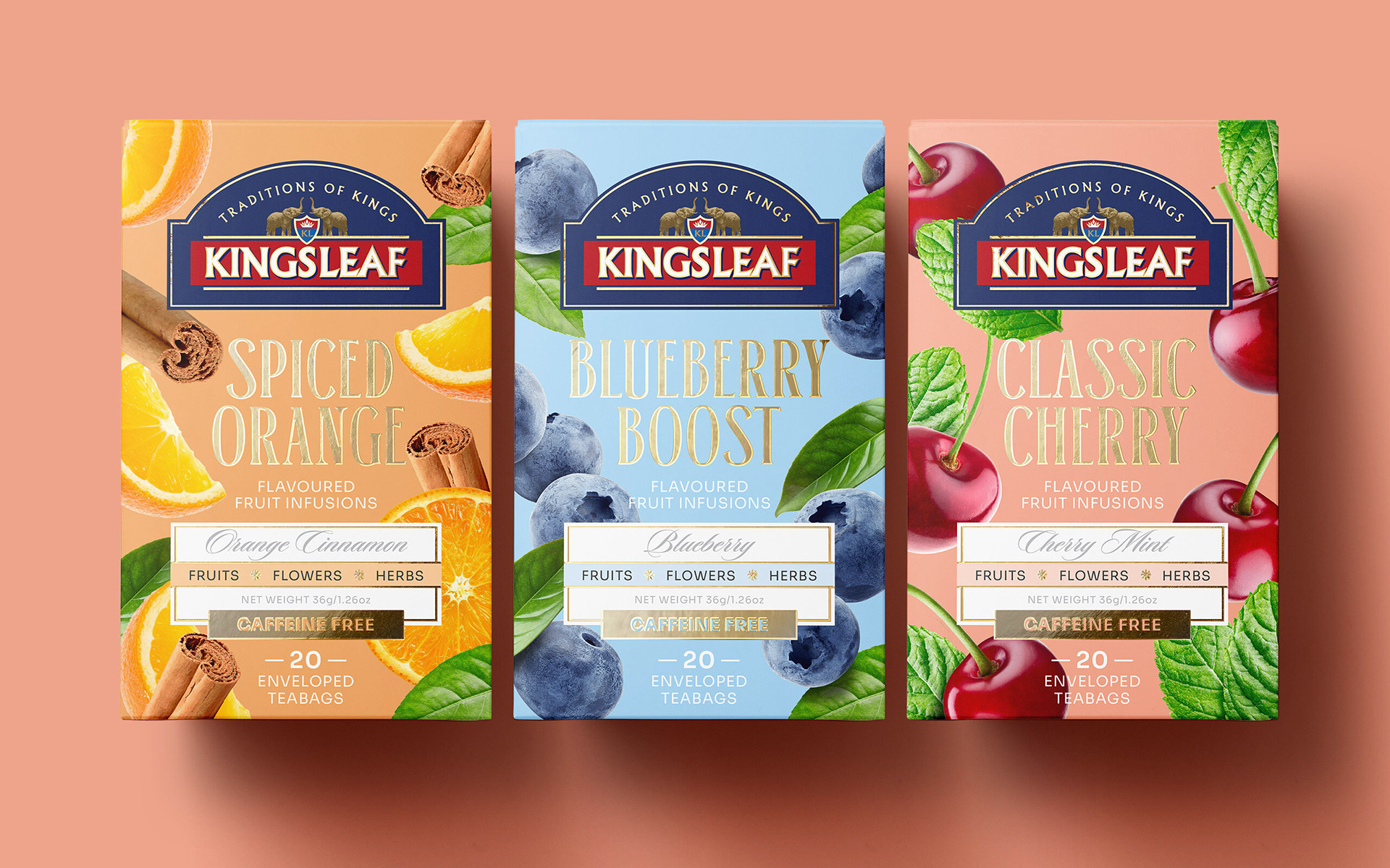
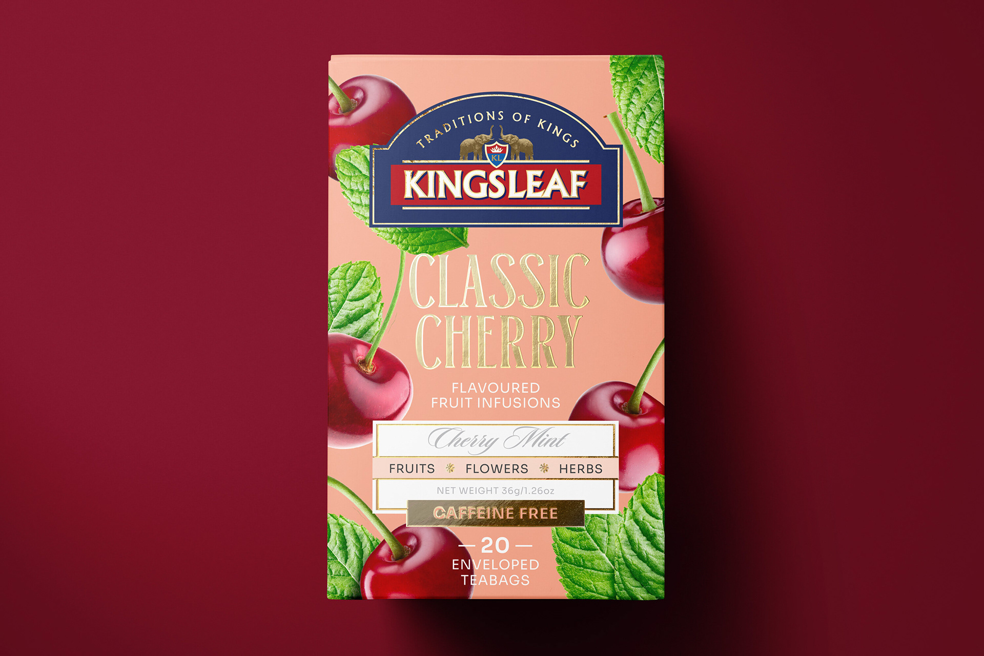
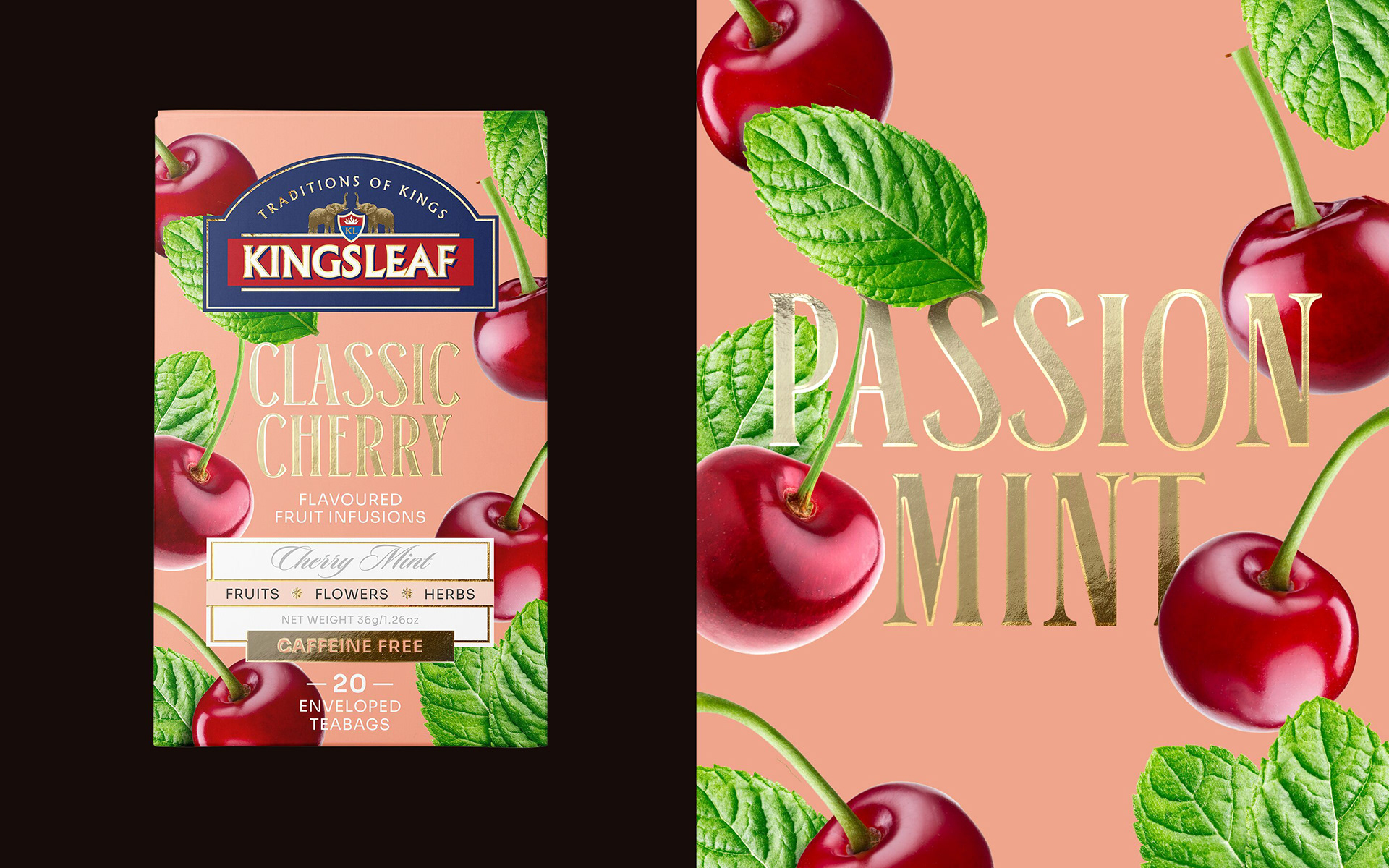
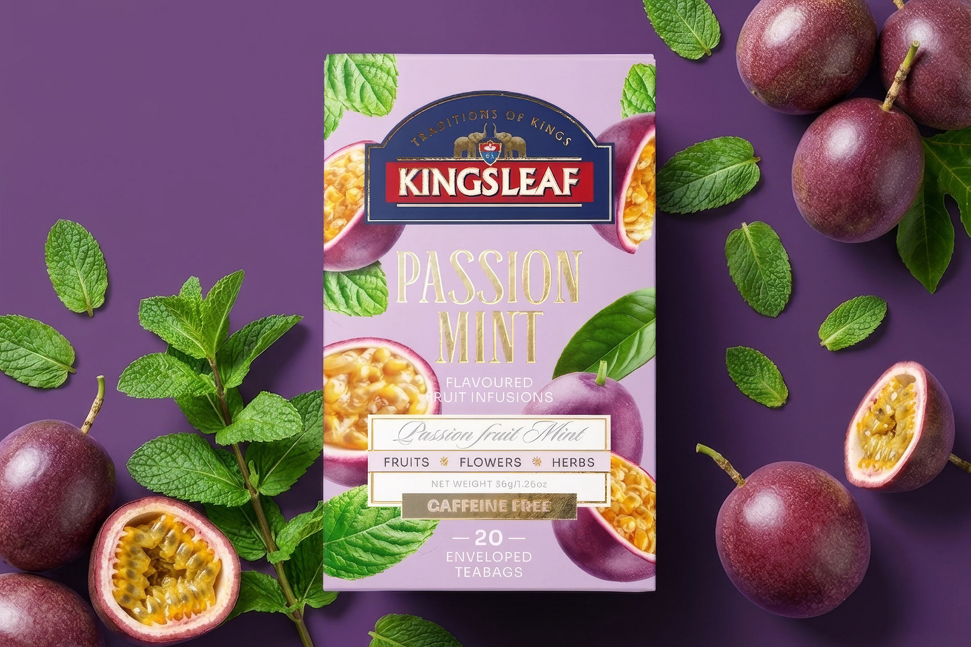
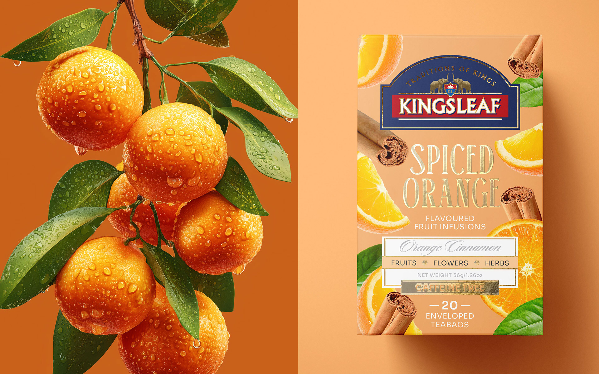
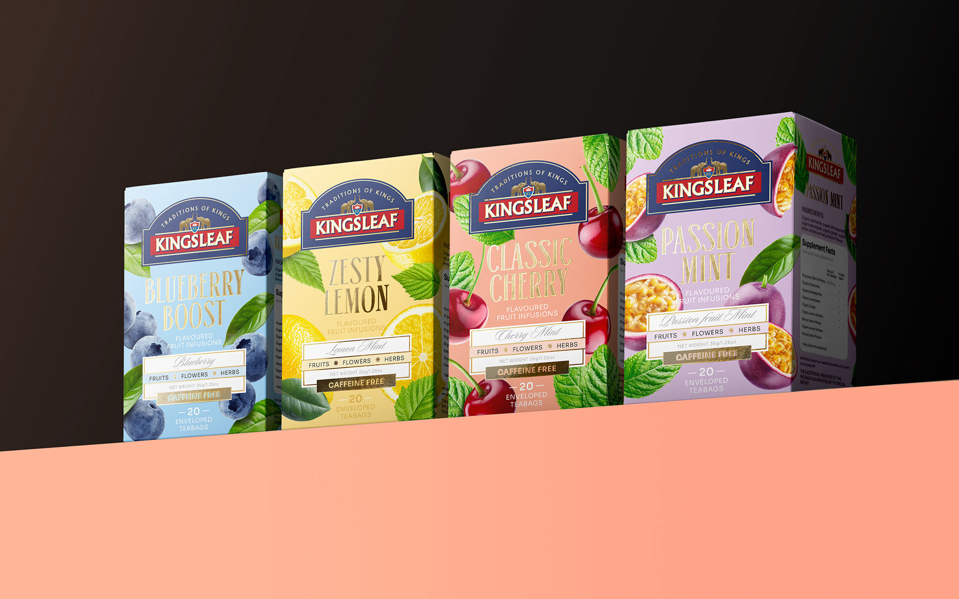
This packaging design for the Kingsleaf fruit tea series is strategically crafted for the mid-to-high-end consumer segment. The primary objective is to enable the consumer to "taste" the flavor and experience the emotional resonance of the fruit through visual cues the moment they encounter the product on the shelf. It is designed to manifest the vibrancy and sensory delight that a fruit tea lover envisions.
This packaging design for the Kingsleaf fruit tea series is strategically crafted for the mid-to-high-end consumer segment. The primary objective is to enable the consumer to "taste" the flavor and experience the emotional resonance of the fruit through visual cues the moment they encounter the product on the shelf. It is designed to manifest the vibrancy and sensory delight that a fruit tea lover envisions.
SOLUTION & PROCESS
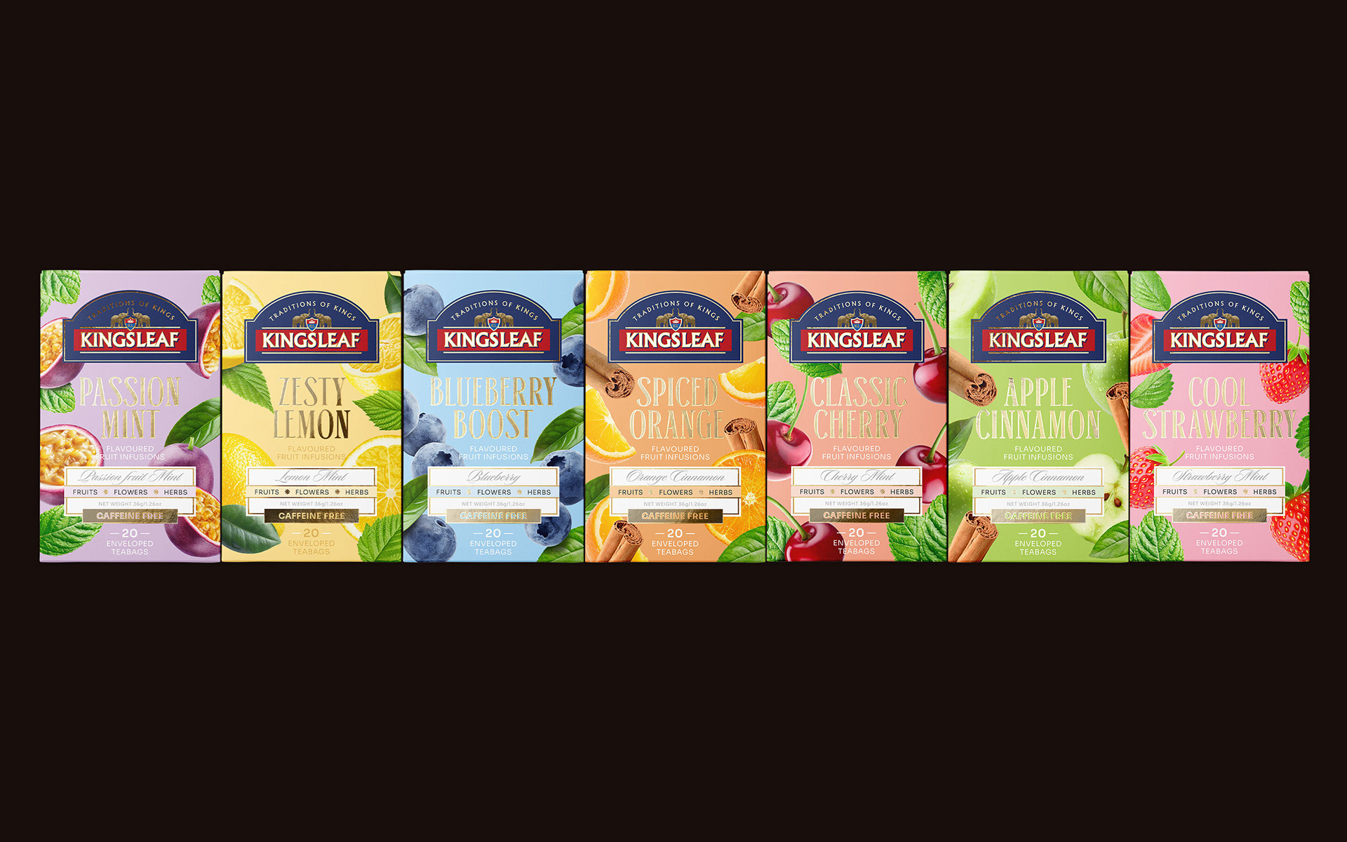
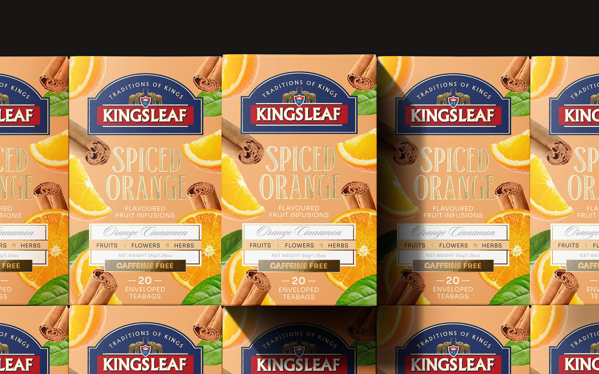
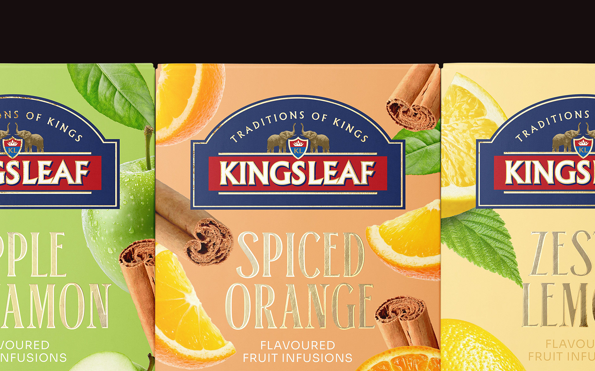
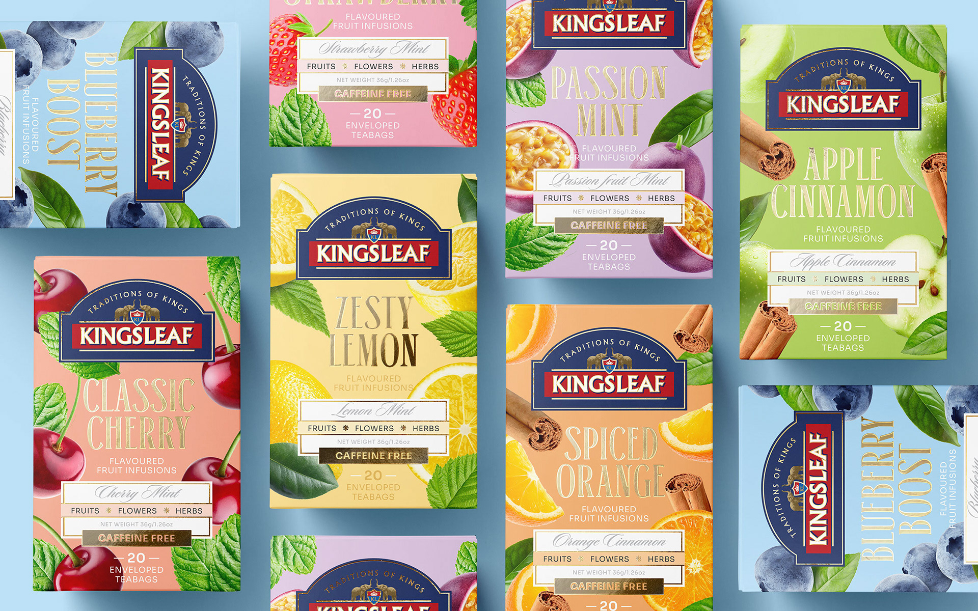
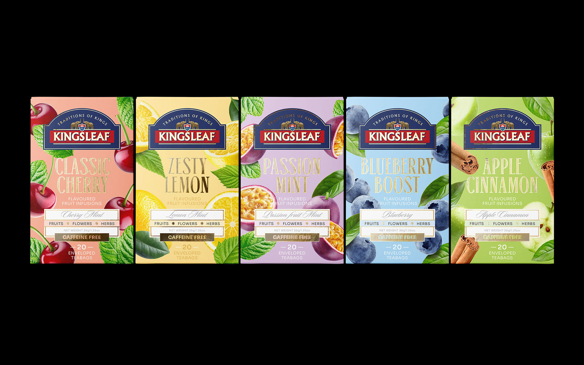
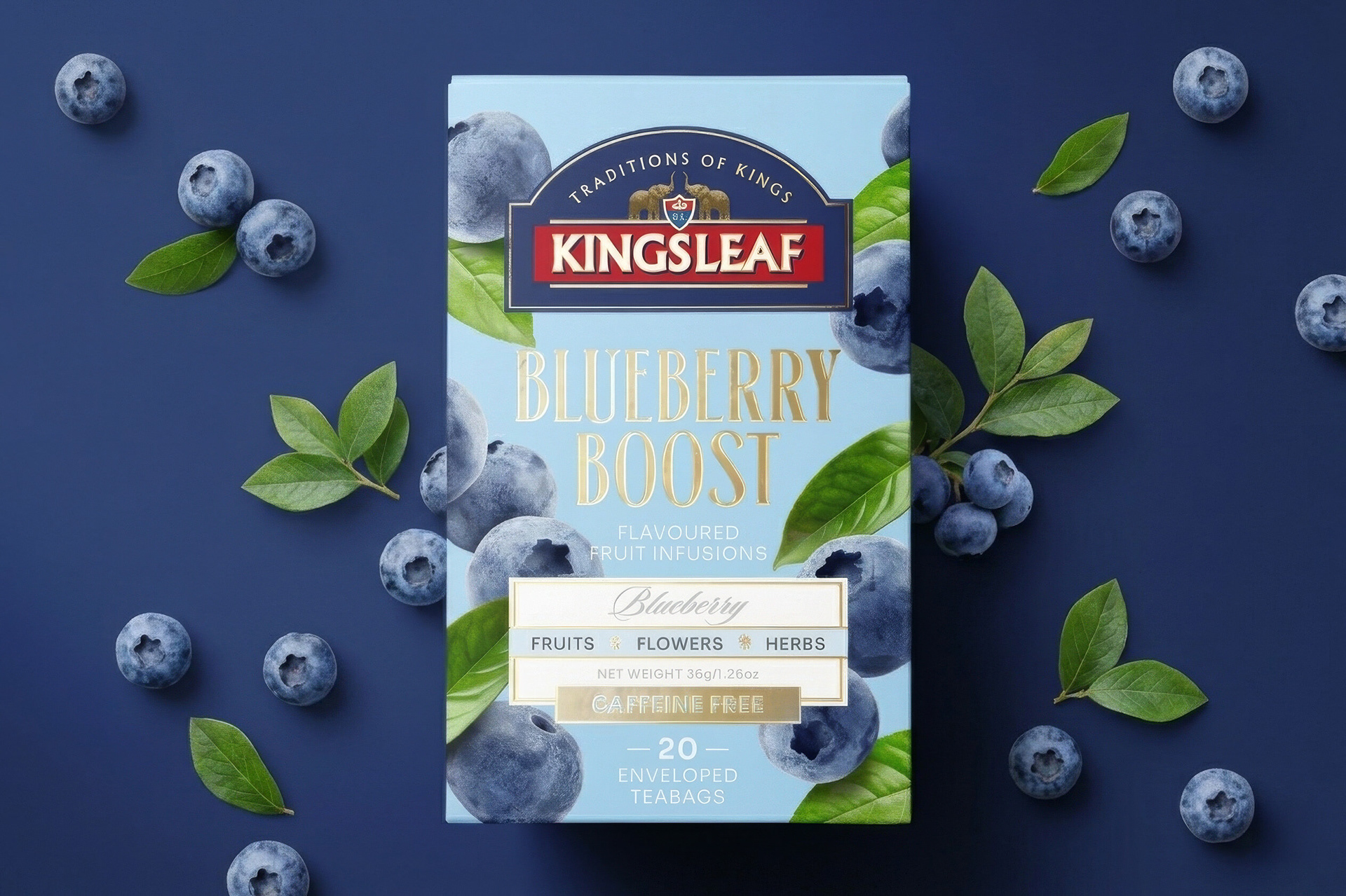
Sensory Experience: The use of vivid and realistic fruit photos emphasizes the product's natural origins and rich flavor profile. The dynamic arrangement of the fruit elements across the packaging evokes a sense of "freshness" and vitality, creating an immediate sensory connection.
Sensory Experience: The use of vivid and realistic fruit photos emphasizes the product's natural origins and rich flavor profile. The dynamic arrangement of the fruit elements across the packaging evokes a sense of "freshness" and vitality, creating an immediate sensory connection.
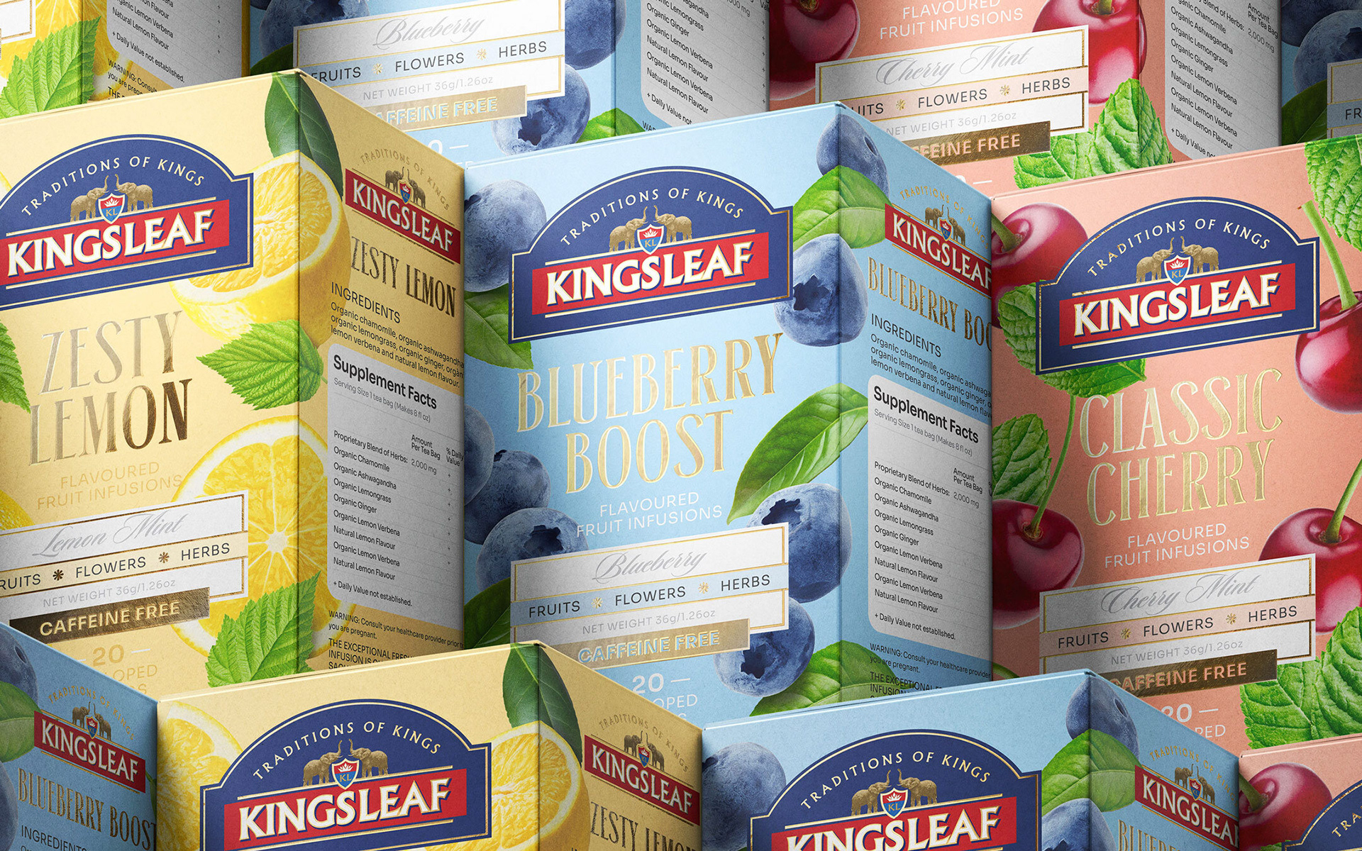
Synthesis of Modern & Vintage: While the classic logo structure and typographic details pay homage to the brand’s heritage, "Traditions of Kings," through a vintage touch, the minimalist and clean background colors modernize the design. This visual language not only aligns with contemporary aesthetics but also streamlines the printing process for optimal clarity.
Color Psychology & SKU Navigation: Each flavor is distinguished by its own vibrant color palette. This strategic use of color enhances shelf presence and contrast, allowing consumers to navigate intuitively through the various SKUs and make their selection with ease.
CONCLUSION
Kingsleaf packaging is more than just a tea box; it is a narrative born from the dance of fruits and botanicals. One glance is enough to uplift the viewer's mood and evoke a positive emotional rhythm. Through high contrast, rich detailing, and lifelike visuals, the product commands attention on any retail shelf, distinctly setting itself apart from the competition.
Kingsleaf packaging is more than just a tea box; it is a narrative born from the dance of fruits and botanicals. One glance is enough to uplift the viewer's mood and evoke a positive emotional rhythm. Through high contrast, rich detailing, and lifelike visuals, the product commands attention on any retail shelf, distinctly setting itself apart from the competition.