Brief
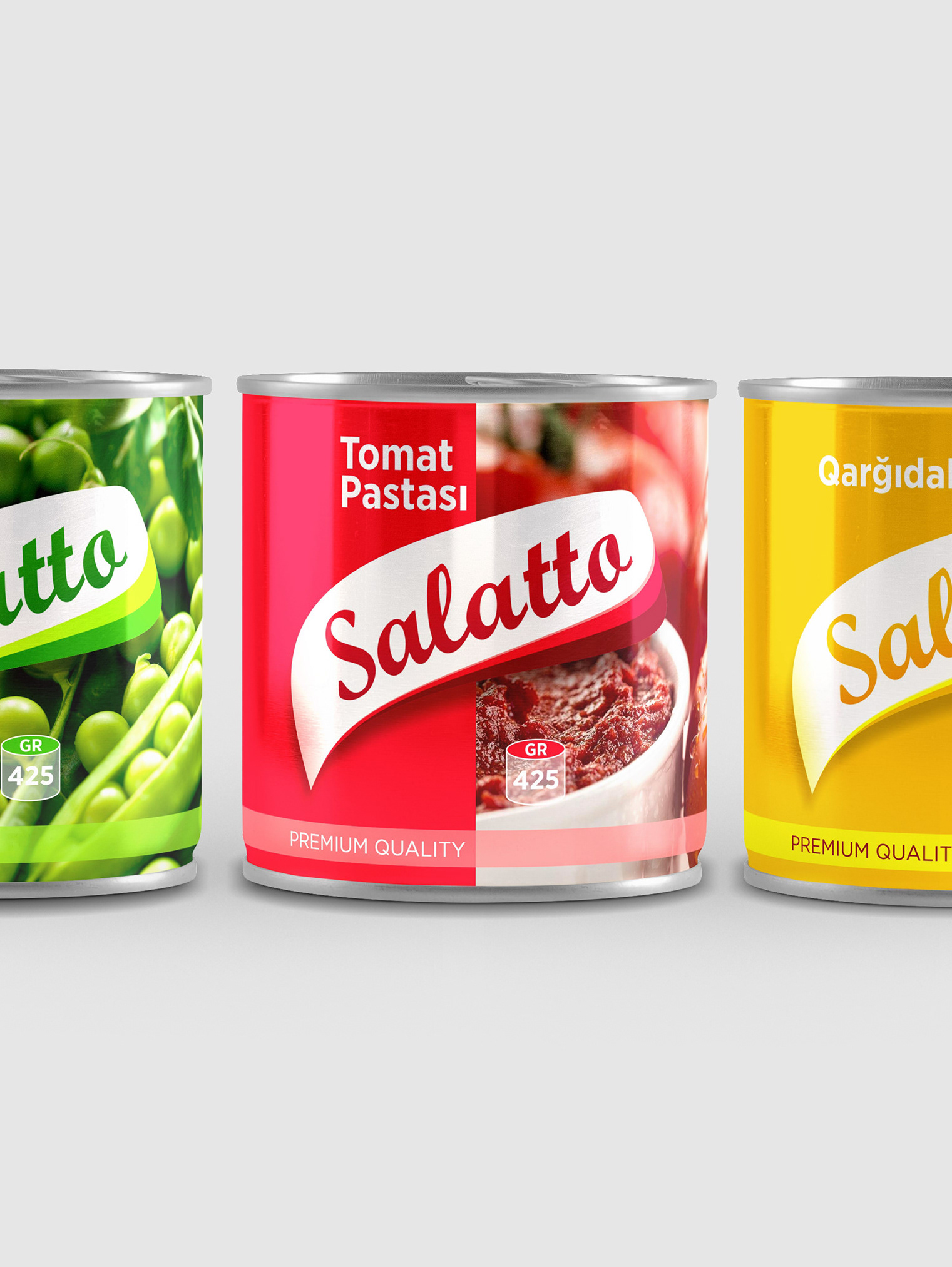
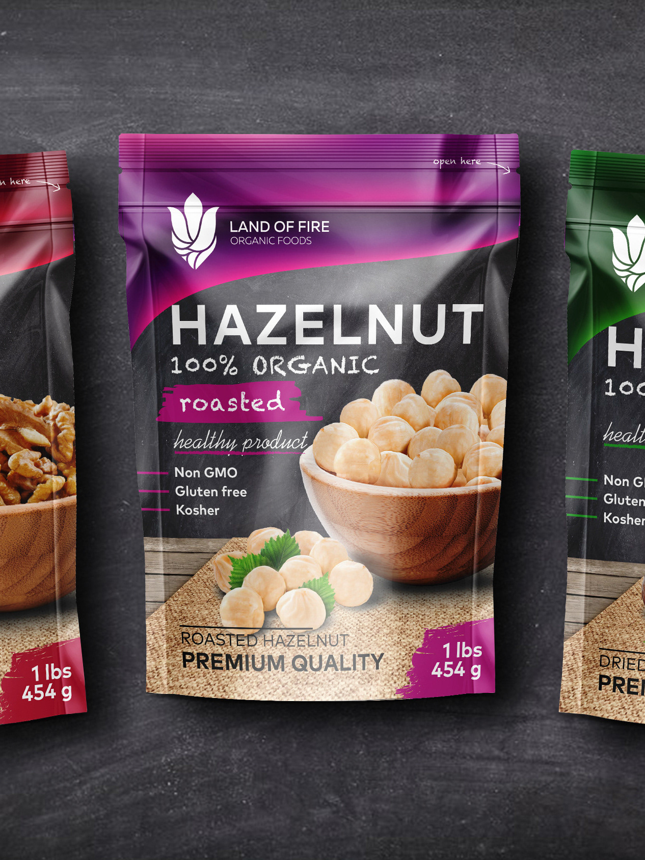
Conduct market research to create a oil brand that can compete in the long term in the local market. It had to be easily accepted by customers and memorable. Ergonomics was also to be one of the key details.
Solution
The colors were determined based on the study. Then we tried to apply the originality of sunflower and corn both on the packaging and on the label. We combined the ergonomics of packaging with natural patterns. On the label, we created a common shape by minimizing corn and sunflower seeds. We finished the job with a great combination and thoughtful design. At present, product estimates in the local market are correct.
Creative director: Rahim Ismayil
Art director: Aysham Ismayil
Modeling: Rahim Ismayil
Location: Azerbaijan
Client: Veyseloglu Group of Companies

